Dating App Branding Case Study: Koit Relationship Manager
This dating app branding case study shows how strategy and design helped Koit launch as a trusted player in a crowded market.
Koit needed to stand out. It also needed to build trust fast. Through clear positioning and a strong visual identity, the brand gained credibility and supported a confident go-to-market launch.
This project shows how effective dating app branding can turn a complex digital product into a clear, human experience.
About Project
Koit is a relationship manager and dating app built to help users create meaningful connections. Instead of chasing endless matches, users focus on quality and intention.
The company was led by Miller Simberg, a former Amazon executive. He saw a gap in the market.
Professionals use CRM tools to manage business relationships. But no tool existed to manage personal or romantic ones.
That insight shaped the dating app branding strategy.
Koit was not positioned as another swipe-based platform. It was positioned as a relationship manager.
The name Koit comes from Estonian mythology. Koit represents an eternal lover who meets their partner briefly at dawn and dusk. This story inspired a brand built on intention, depth, and meaningful moments.
The Dating App Branding Challenge
The dating app market is crowded. Many apps look and feel the same.
Koit faced several challenges:
Stand out in a saturated category
Show value beyond matching features
Build trust around sensitive data
Appeal to different age groups
The target audience included:
Younger users who feel anxiety around dating
Professionals over forty who want meaningful relationships but have little time
The dating app branding needed to feel warm, modern, and trustworthy. It could not feel generic or overly corporate.
Goals of the PROJECT
The dating app branding process focused on clear business goals:
Define a strong market position
Build a complete visual identity system
Differentiate from other dating apps
Communicate privacy and security clearly
Create a scalable foundation for growth
Clear goals made decision-making easier and faster.
Brand Strategy and Positioning
Research and Insights
The brand strategy started with user interviews and competitor research.
Common pain points appeared:
Shallow conversations
Low-quality matches
Anxiety before dates
Poor organization of interactions
Low trust in platforms
Most dating apps focus on algorithms and matching speed. Few address emotional preparation or relationship management.
This insight shaped the positioning:
A relationship manager that helps users prepare, remember, and connect with intention.
Brand Pillars
The dating app branding strategy was built on three pillars.
Intentionality: Encourage users to prepare and reflect before meeting.
Security: Make privacy feel calm and reliable.
Innovation: Use AI to support human connection, not replace it.
The brand personality is friendly, modern, and supportive. Koit acts like a trusted assistant, not a flashy dating app.
Business Impact
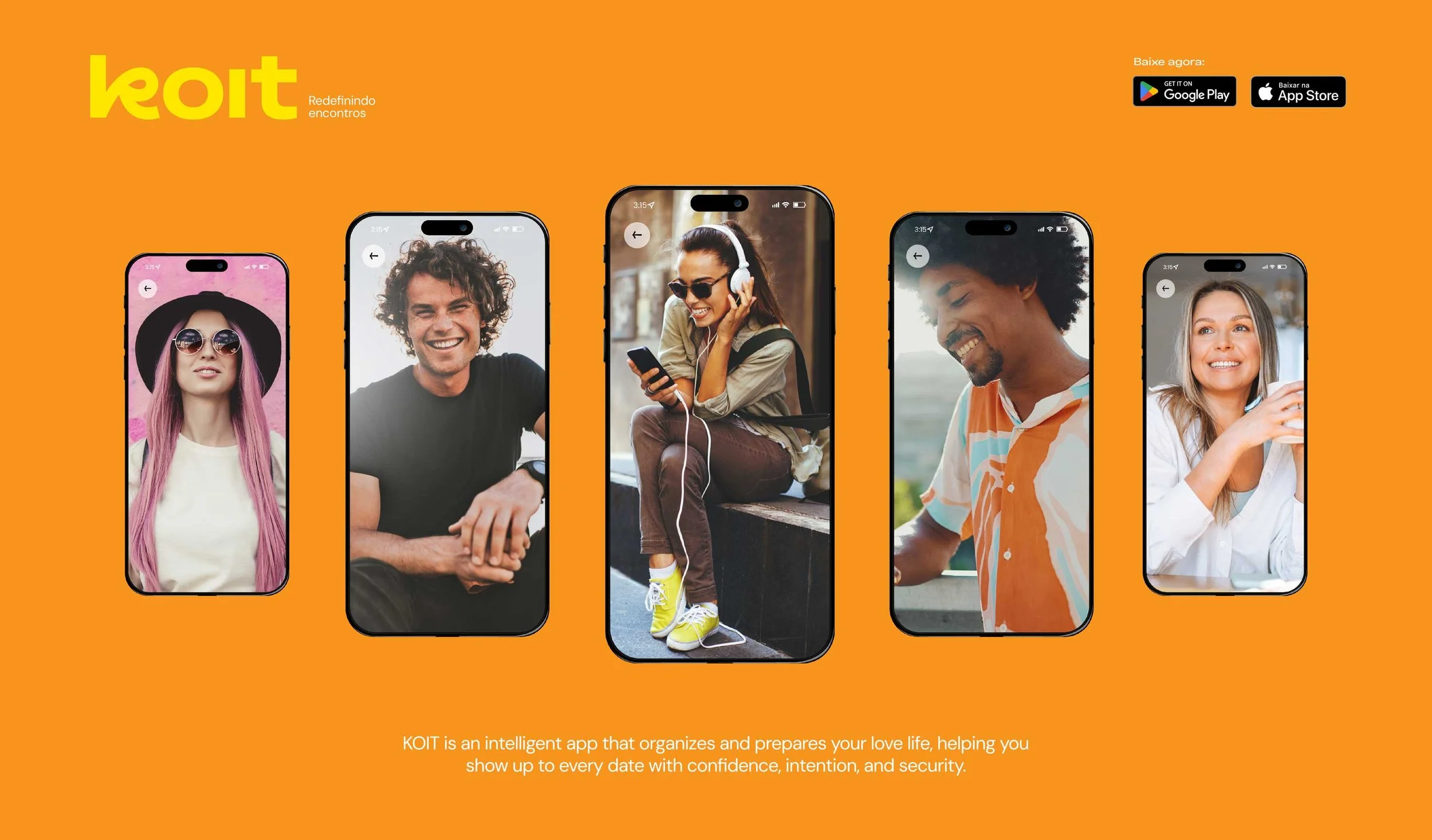
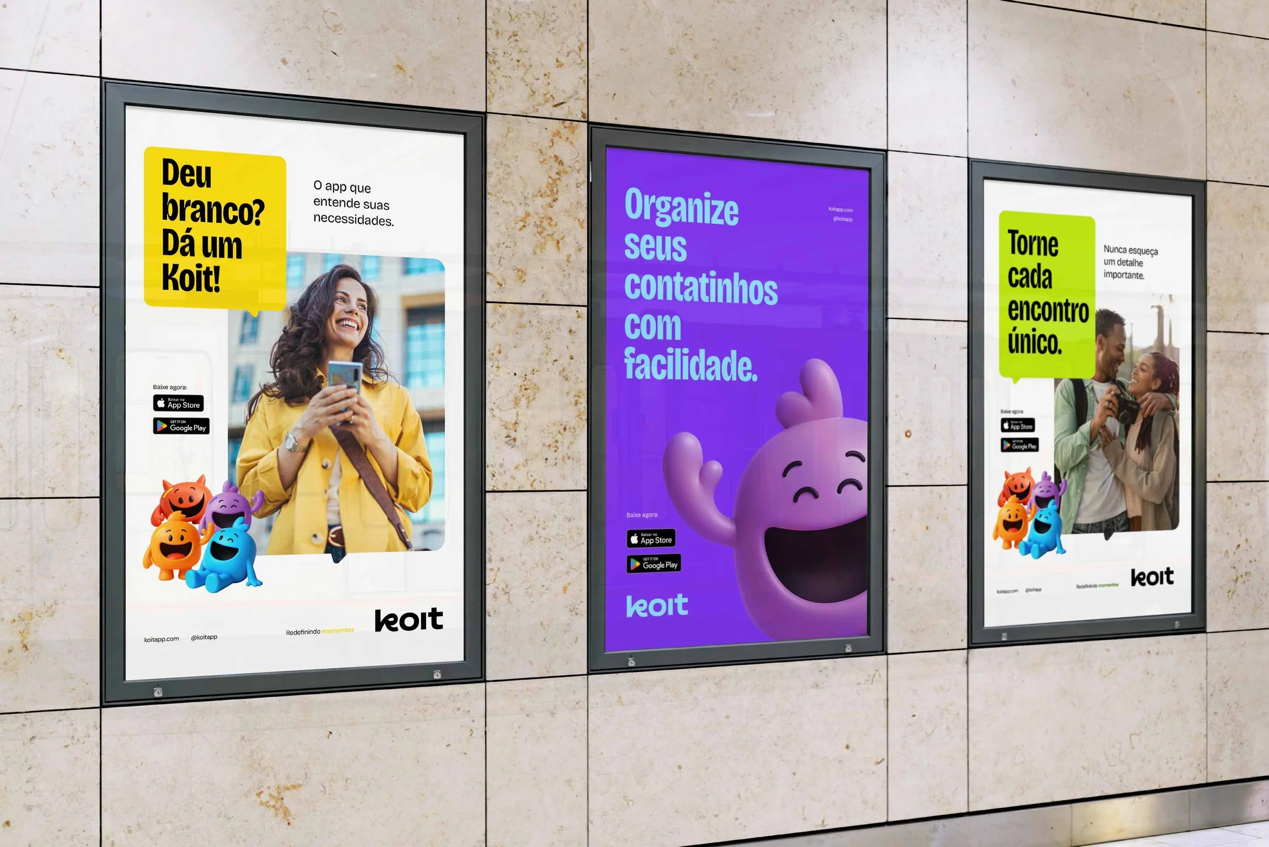
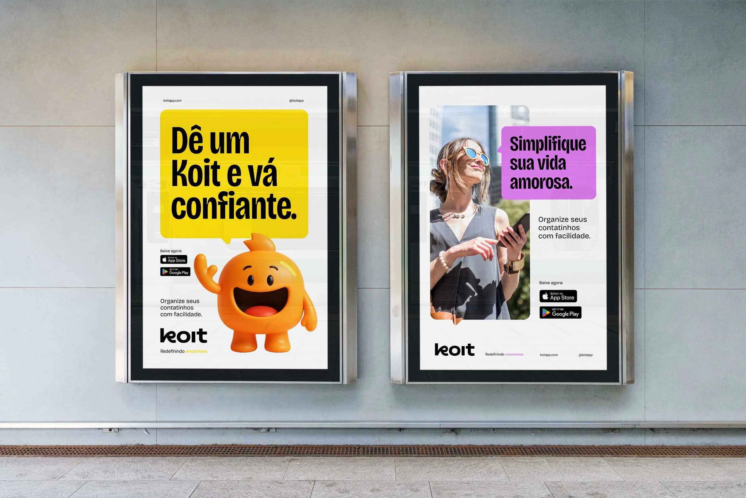
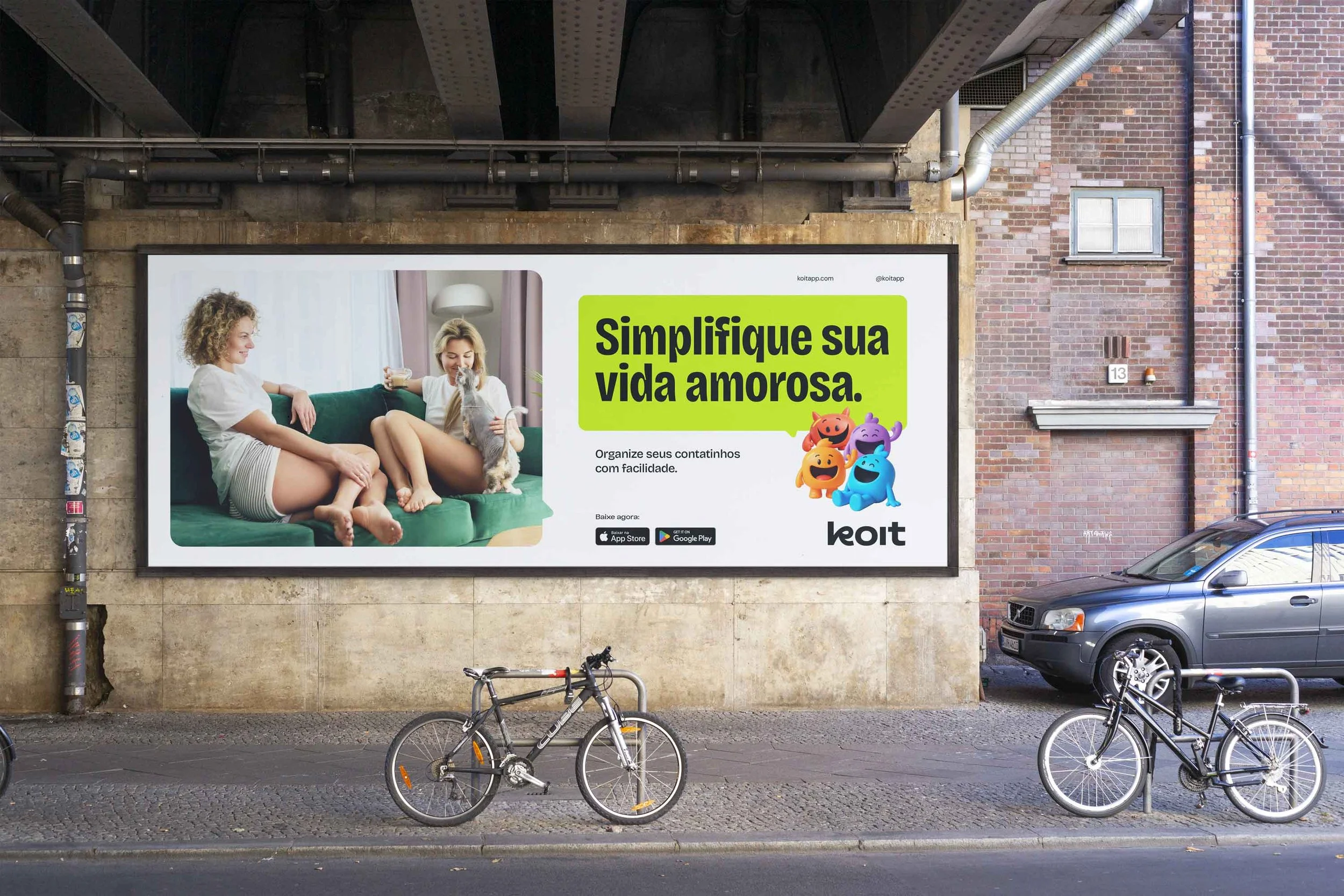
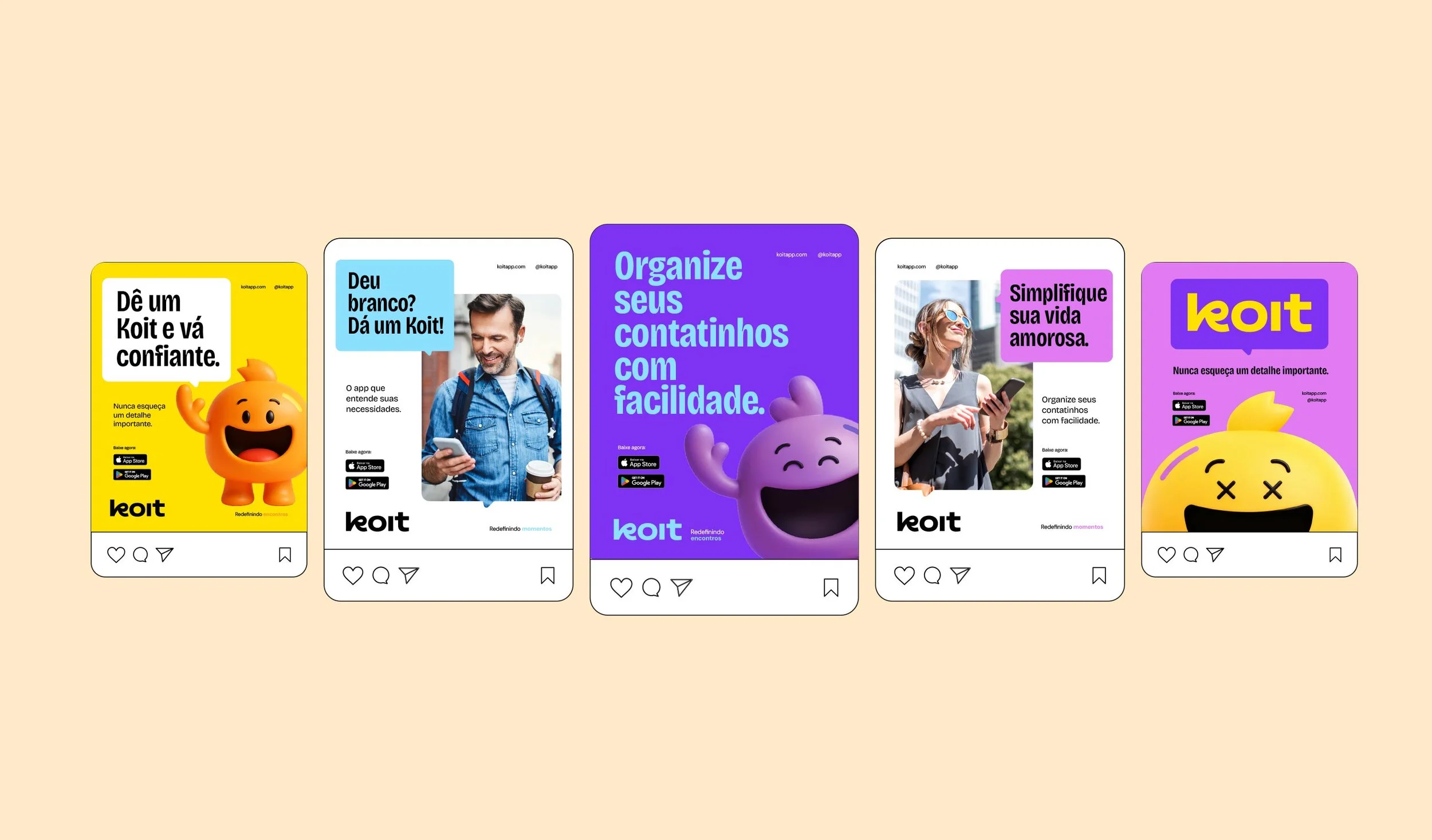
The final dating app branding system works across all touchpoints.
Deliverables included:
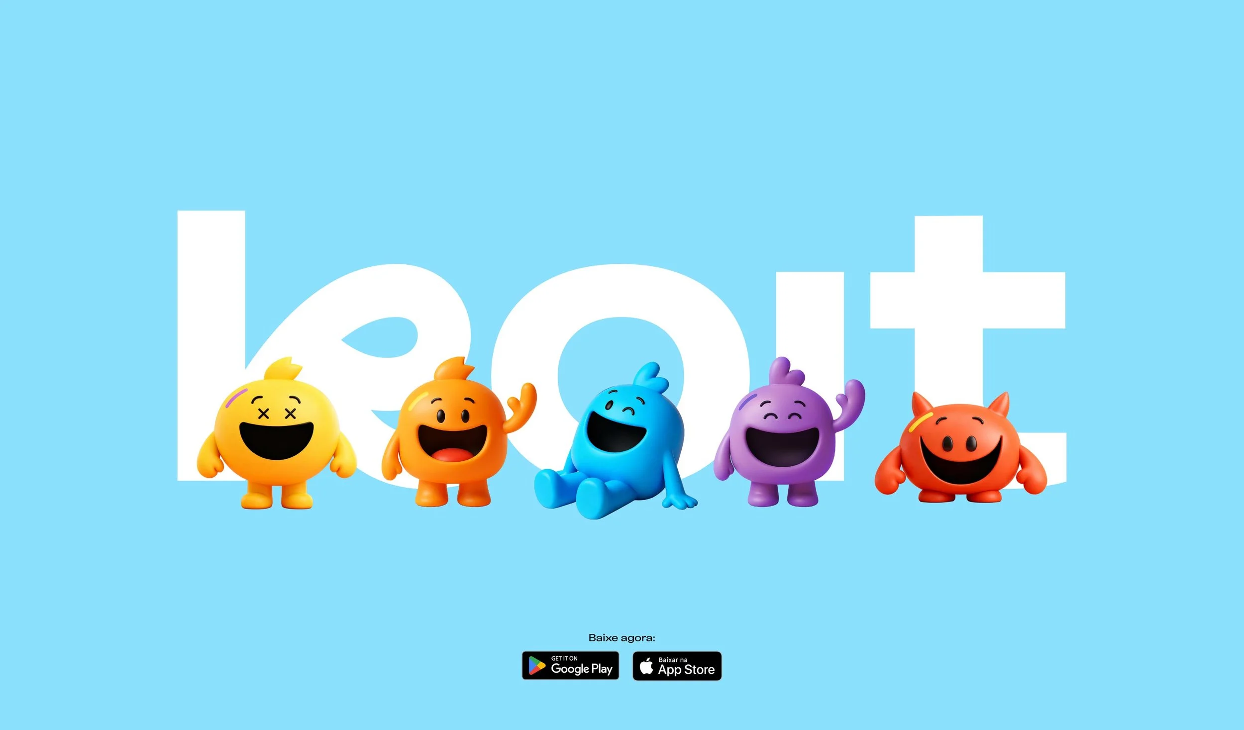
A flexible logo system
A clear color and typography framework
Brand assets for app UI and marketing
The structured system allowed the company to move smoothly from branding to launch.
Key Takeaways from This Dating App Branding Case Study
This project shows important lessons:
Strong dating app branding builds trust before users try the product
Clear positioning matters more than long feature lists
Visual design affects how users perceive security
One strong brand can serve different age groups
These lessons apply to any digital product in a sensitive market.
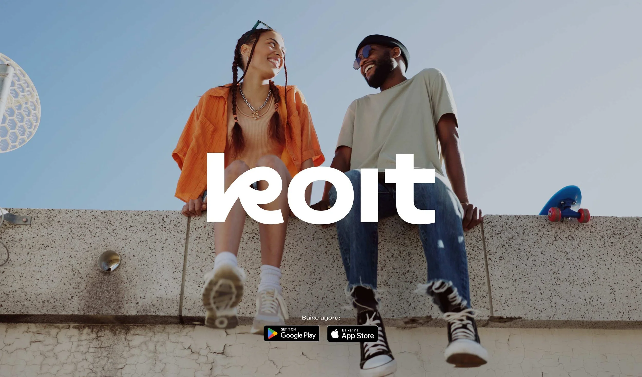
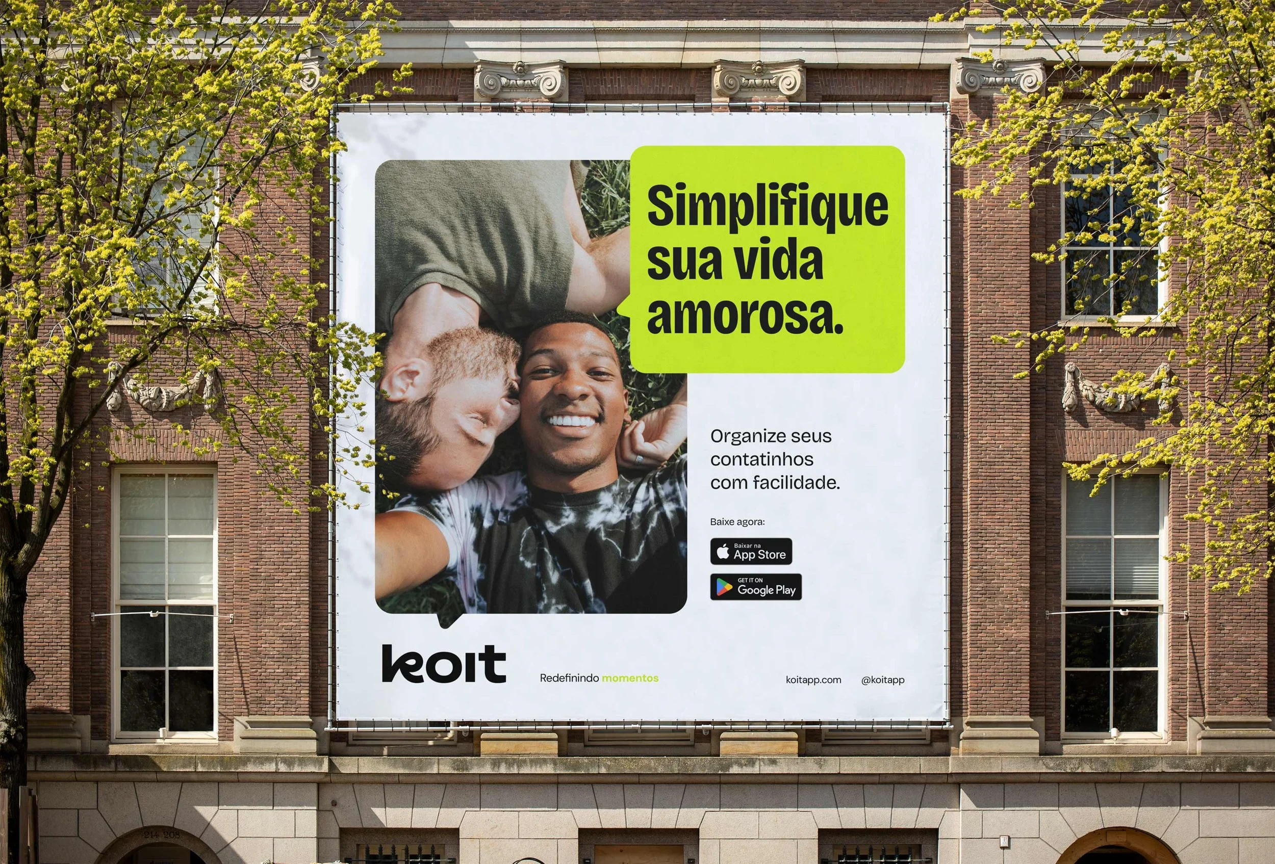
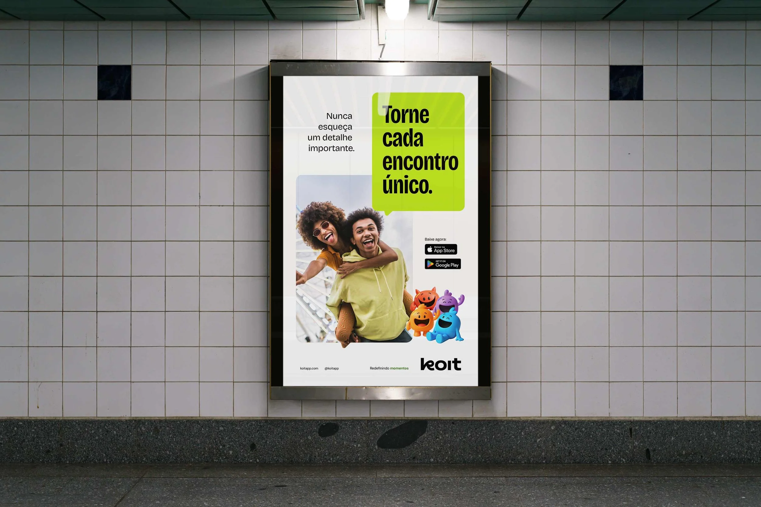
Visual Identity Design Execution
Creative Direction
People prepare for work meetings. They rarely prepare for dates.
Koit changes that.
The visual identity presents the app as a supportive tool. It helps users show up with confidence.
The tone of voice is:
Clear
Warm
Encouraging
This tone works well for emotionally sensitive products like dating apps.
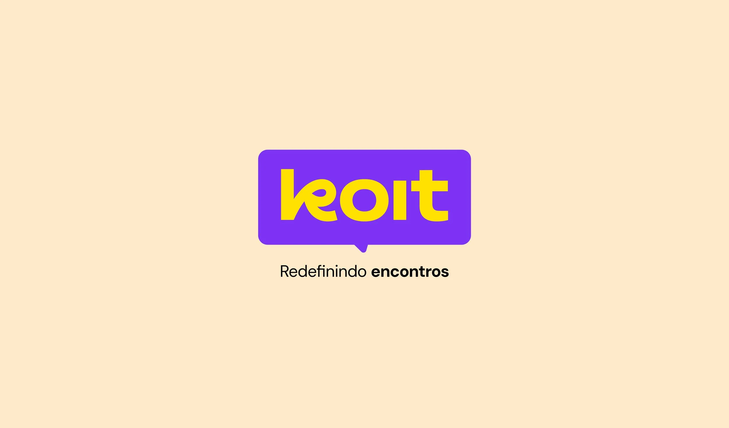
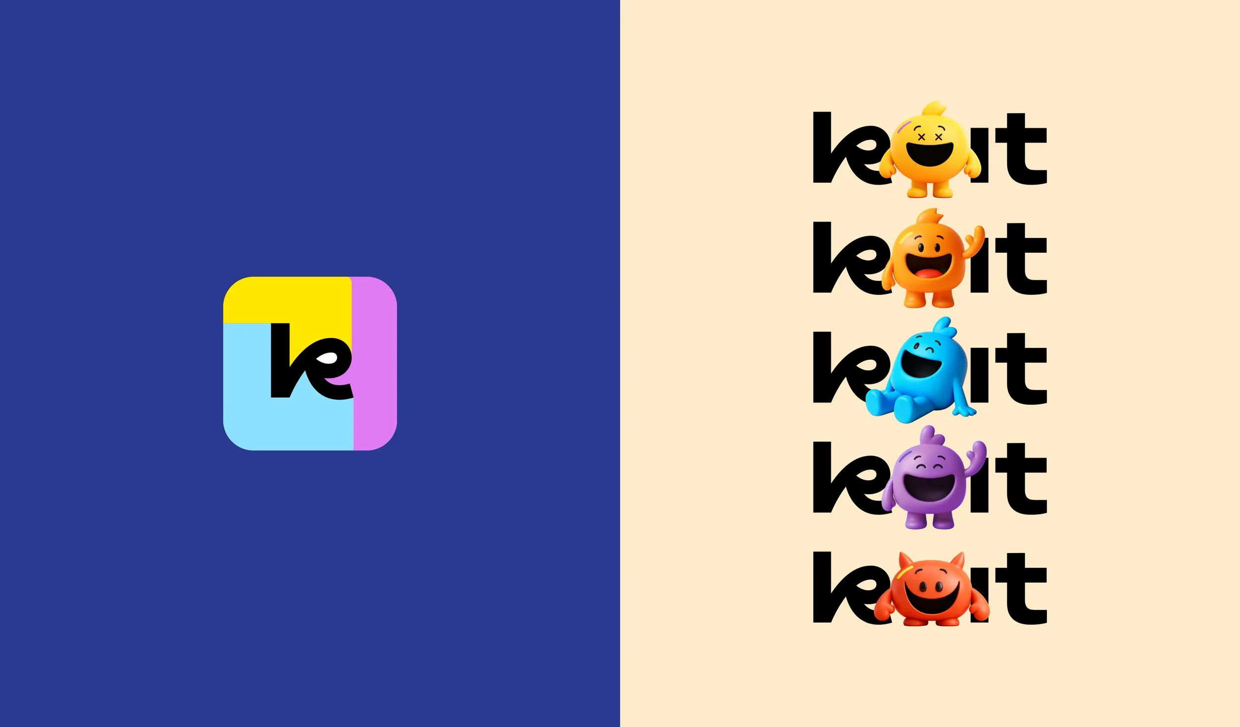
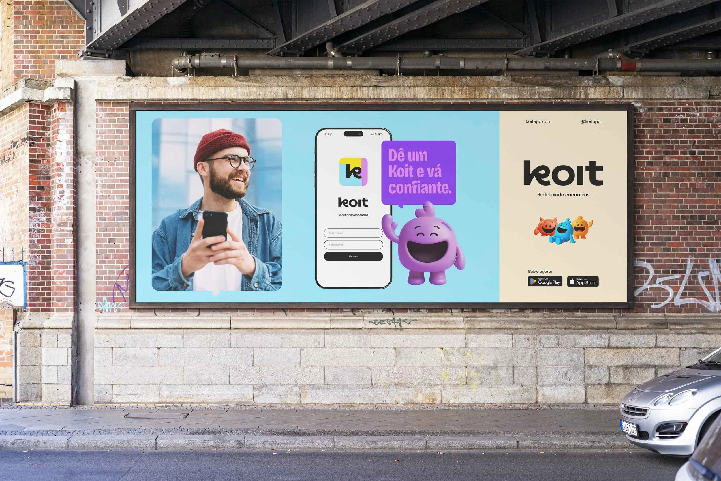
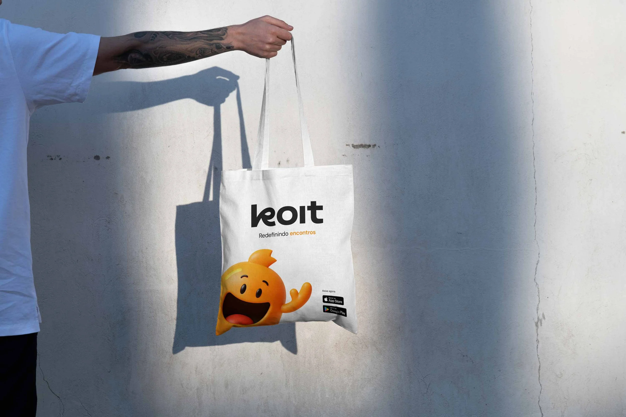
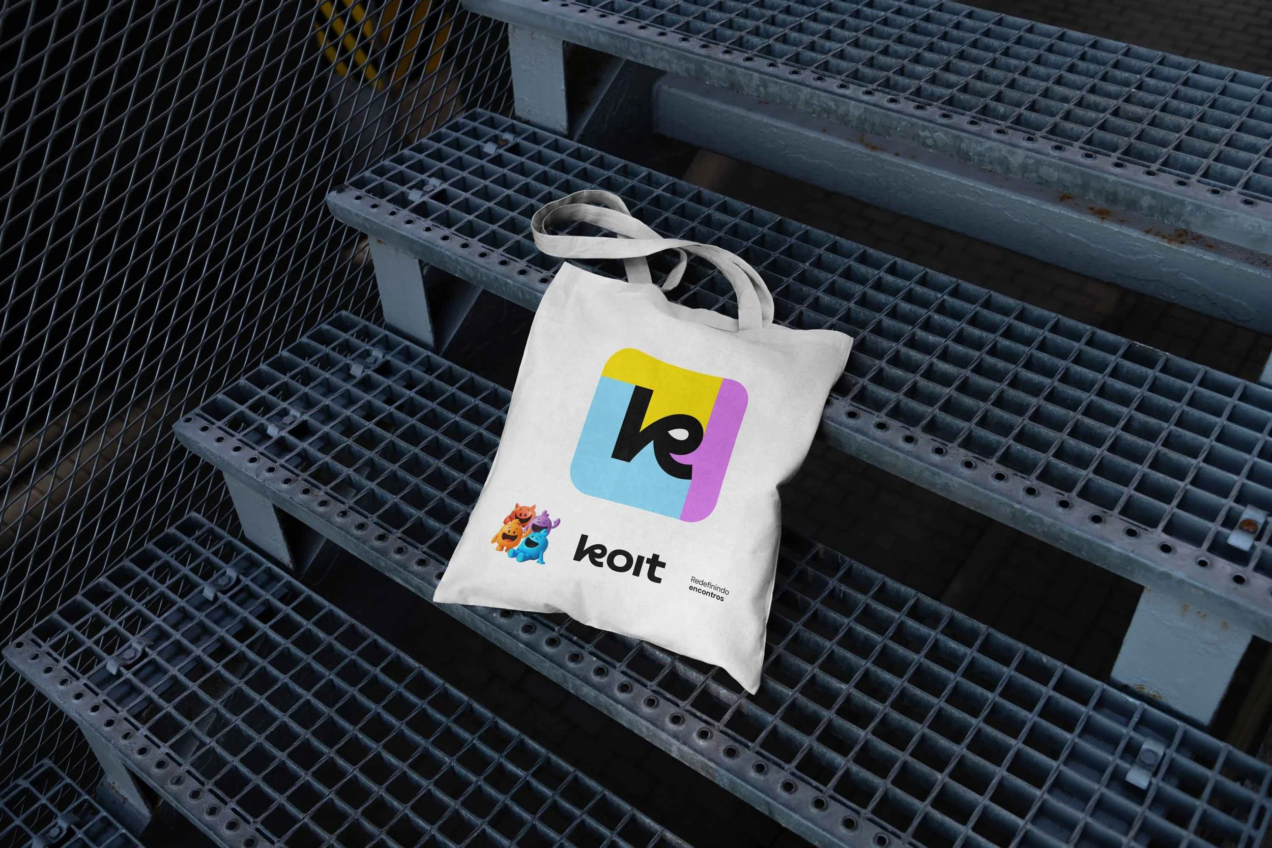
Logo Design
The logo combines a speech bubble with a soft embracing shape. It represents:
Conversation
Safety
Emotional connection
This reinforces the dating app branding position as a relationship-focused platform.
The wordmark uses a modified Vinila typeface. It ensures clarity and scalability across digital platforms.
Why This Dating App Branding Strategy Worked
This case study solved real emotional problems. Users feel anxiety, disorganization, and low trust in dating apps.
The brand addressed these issues directly.
It communicated value in a clear and simple way.
The result was a credible, market-ready product with strong growth potential.
For founders investing in dating app branding, this case shows how strategy and design can speed up trust and adoption.
Ready to start a new project?
Drop us a message to schedule a meeting or request a customized quote. We'd love to hear more about challenges.