

Wisetide Case Study: Building a Complete Corporate Identity for a Boutique Tech Consultancy
How does a new consultancy stand out against McKinsey, ThoughtWorks, and IDEO? What if it has deep expertise but no name, no logo, and no visual language? This case study documents the full brand development process behind Wisetide. Wisetide is a boutique product and engineering consultancy for scaling startups. You will see how a B2B creative agency turned a blank page into a complete corporate identity. The work covers research, brand strategy, naming, logo design, and a full brand book. Are you looking for brand identity services for a tech company or consulting firm? This case shows what a strategy-led corporate identity project looks like in practice, stage by stage.
Project Overview
Client Profile: A Product & Engineering Consultancy for Scaling Startups
The client is a premium boutique consultancy led by two partners. One comes from product. The other comes from engineering. Together, they help tech companies fix the disconnect between product strategy and engineering execution. This gap slows delivery and erodes team culture as companies grow.
Their main market is Series A to C startups scaling their engineering teams. Most have fewer than 200 employees. These companies hit a point where informal processes stop working. Founder-led decisions no longer scale. They need outside guidance to grow without losing speed, quality, or culture.
Unlike large firms, the client had no interest in unchecked growth. The business model is boutique on purpose. Fewer clients. Deeper engagement. Real transformation instead of generic frameworks. That choice shaped every step of the branding project.
Project Scope: Brand Strategy, Naming, and Corporate Identity Design
The engagement began with a detailed project brief and a structured client onboarding. Business goals, audience, and market ambitions were documented first. Only then did the creative work start. The scope of work covered four stages over about eight weeks:
Research & Discovery, including a brand audit and competitor analysis
Brand Strategy, defining positioning, values, personality, and tone of voice
Naming, creating and validating the verbal identity
Logo & Corporate Identity Design, turning strategy into a complete visual system
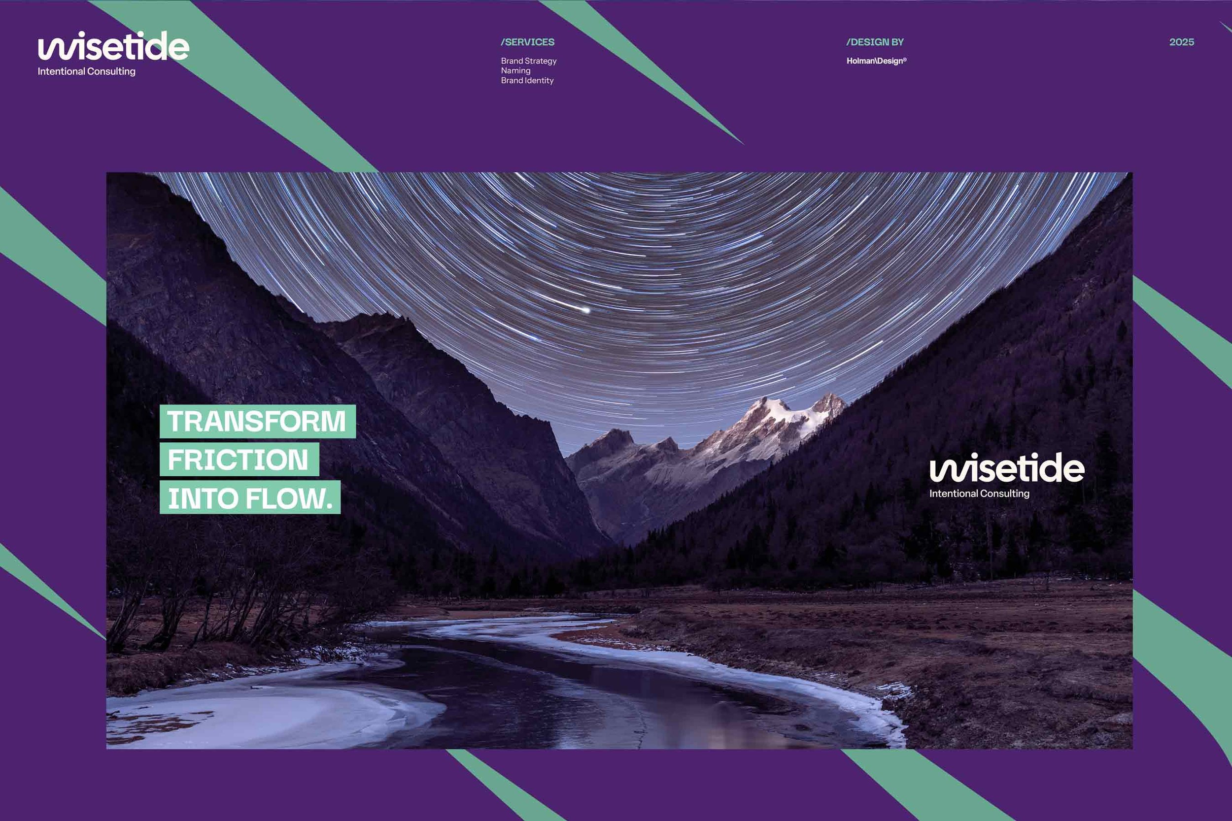
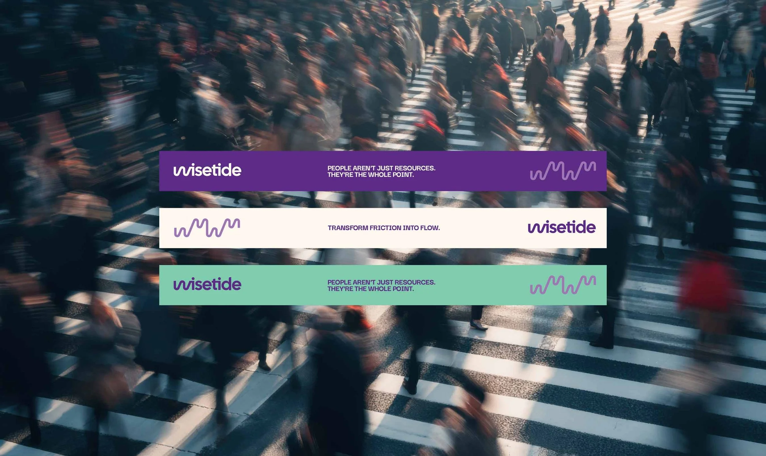
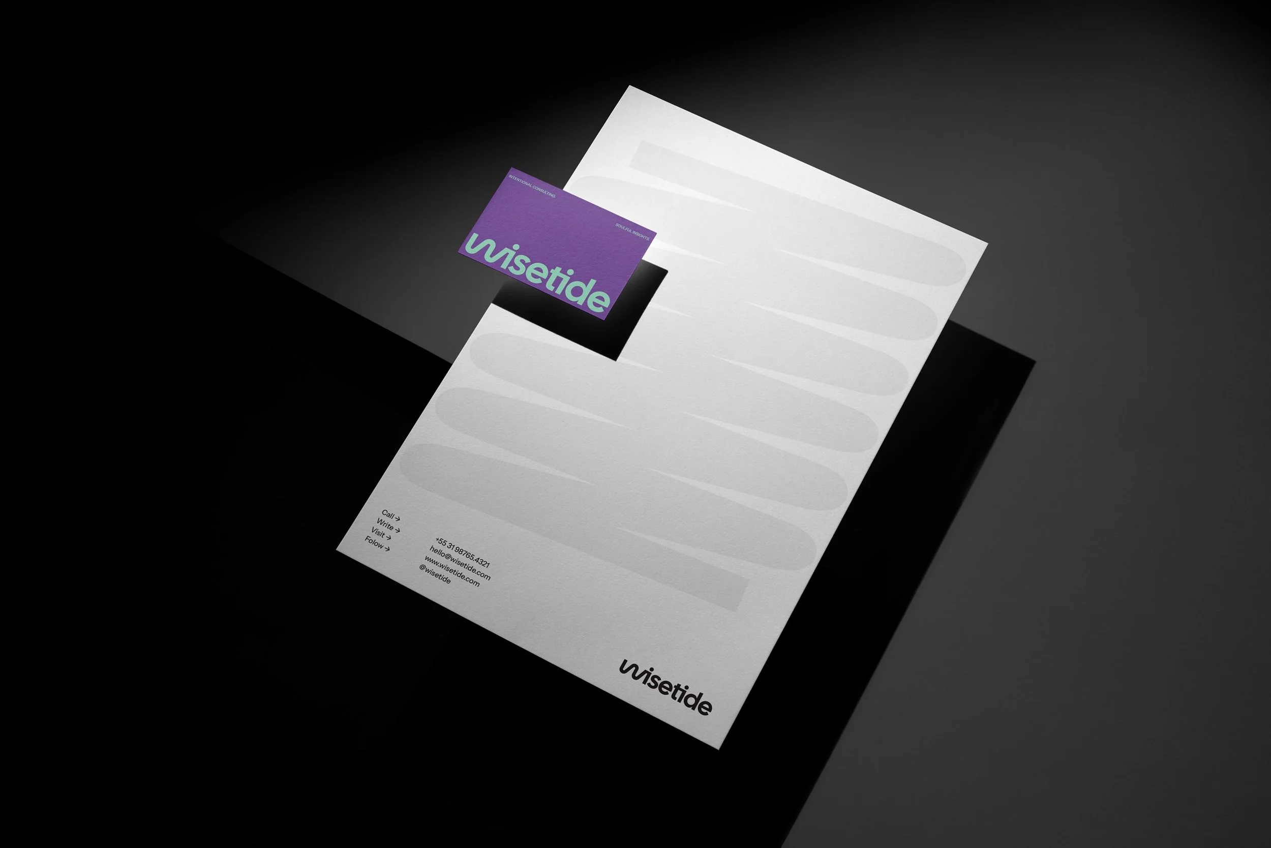
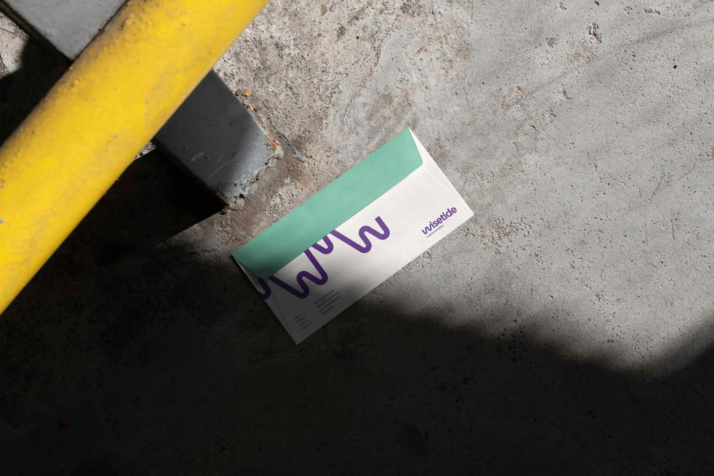
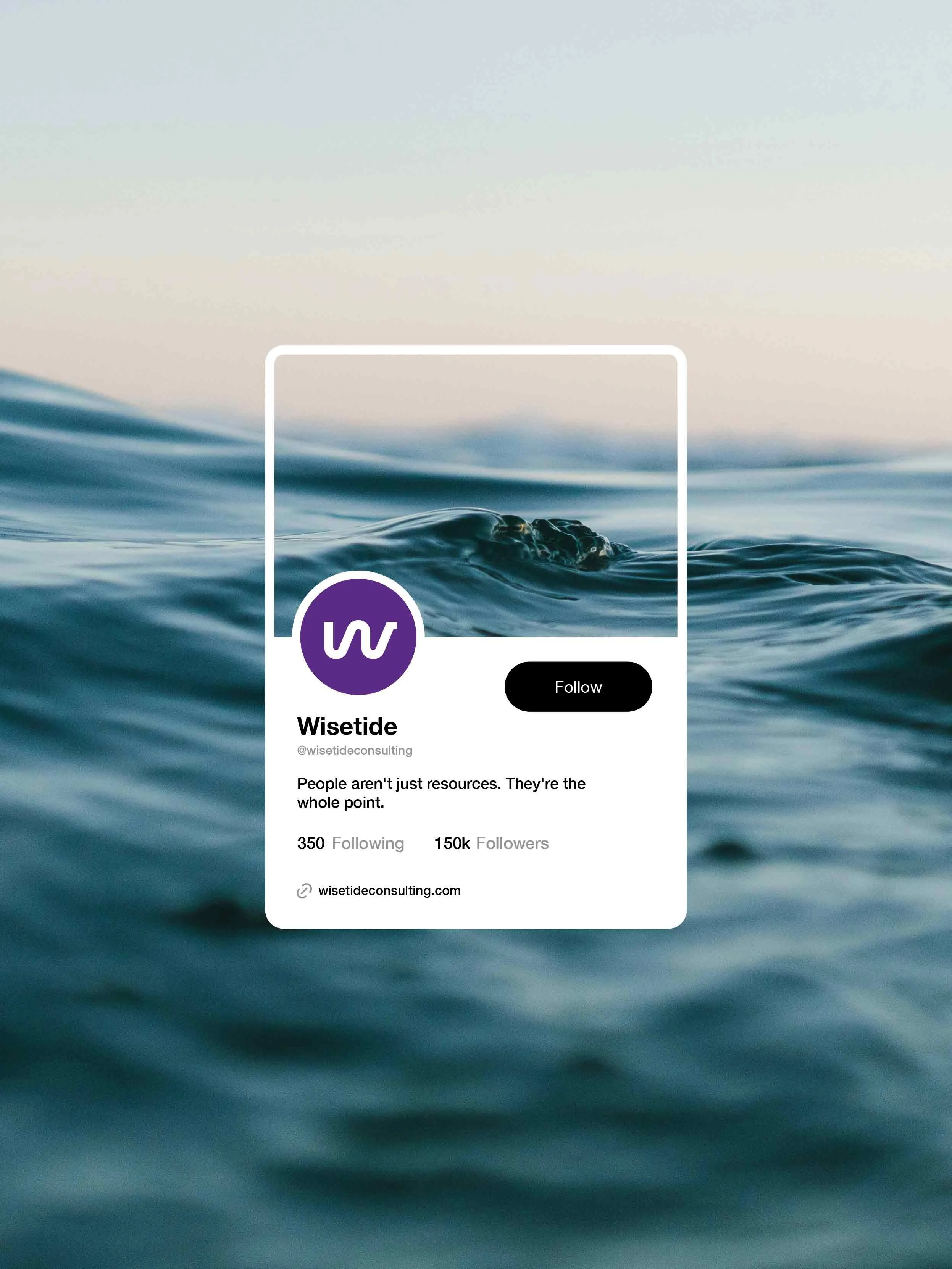
The final delivery included the logo system, color palette, typography, and graphic elements. It also covered business items like an email signature and a slide deck. A social media kit, landing page guidelines, and a full brand book completed the package. This end-to-end brand development process is what sets a corporate identity apart from a simple logo. Every visual choice traces back to the discovery phase.
CLIENT: WISETIDE - INTENTIONAL CONSULTING
INDUSTRY: TECH CONSULTANCY
SERVICES: BRAND STRATEGY, NAMING, LOGO & BRAND IDENTITY DESIGN,
LOCATION: BELO HORIZONTE - MINAS GERAIS - BRAZIL
YEAR: 2025
The Challenge: A Consultancy With Expertise but No Identity
Starting From Zero: No Name, No Logo, No Visual Language
The founders arrived with years of leadership experience. They had a clear point of view and a proven ability to deliver. What they did not have was a brand. No name. No visual identity. No messaging. A prospective client had no way to see the value behind the expertise.
This is a classic brand gap in professional services. The quality of the work exists, but the market cannot see it. A consultancy sells trust and judgment. Buyers form an impression before the first meeting. An absent identity signals an absent business.
The Market Context: Competing With McKinsey, ThoughtWorks, and IDEO
The competitive landscape made the challenge sharper. The consultancy would face three types of players. First, global strategy firms like McKinsey and BCG. Second, engineering-led consultancies like ThoughtWorks and Pivotal Labs. Third, design-driven innovation firms like IDEO. A growing field of boutique fractional CTO services added more pressure.
Each competitor type owns a clear territory. Big firms sell prestige and perceived safety. Engineering firms sell technical depth. Innovation firms sell creativity and method. A new entrant without a distinct identity would be compared on their terms. And it would lose.
The Positioning Dilemma: Branding for Tech Companies in the Middle of the AI Hype
The timing added another layer. The consulting market was riding a wave of AI hype. Many firms sold AI as the answer to every problem. The client believed the opposite. Most scaling problems are about people and practices, not technology.
Branding for tech companies in this context required a clear choice. The brand could follow the hype and blend in. Or it could challenge the consensus and stand for something. The founders chose conviction. They bet on a people-first value proposition. It would speak to leaders tired of tool-driven promises that never stick.
What the Client Needed From a B2B Creative Agency
The client did not need decoration. They needed a B2B creative agency that would do the strategic work first. That meant defining the positioning, finding the right name, and only then designing the identity. The result had to sit next to premium consulting brands and still look different from all of them.
The brief was simple to state and hard to do. Build a corporate identity that makes a two-person boutique feel like a real alternative to firms with thousands of consultants. And do it without pretending to be one of them.
Research & Discovery: Laying the Strategic Foundation
Stakeholder Interviews: Uncovering Purpose, Vision, and the "People First" Belief
The discovery phase started with stakeholder interviews and a structured branding questionnaire. The goal of this brand audit was to find what the founders believed. Not what a generic consultancy is supposed to say.
A clear purpose emerged. The business exists to stop companies from repeating the same avoidable mistakes. The founders had watched these mistakes happen at companies of every size. Technology kept being treated as the solution. People, culture, and strategy were pushed aside.
That insight became the strategic core of the brand. "People First" was not a slogan invented for marketing. It was the founding belief of the business. Research surfaced it. The name, the messaging, and the visuals would later carry it.
Competitor Audit: Mapping Brand Identities and Chromatic Territories in Consulting
The next step was market research on how competing consultancies present themselves. The audit compared offerings, perceived values, and brand identities across the three competitor groups. It produced a SWOT analysis for the most relevant players.
One exercise proved vital for the design phase: mapping competitors on the chromatic circle. The analysis showed that consulting brands cluster around similar tones. That meant a wide range of colors sat unexplored. This single brand insight gave the visual identity a path to differentiation before design even started.
Audience Definition: Series A–C Startups and Their Real Pain Points
Finally, the research defined the audience persona with precision. The typical buyer is a founder or engineering leader at a scaling startup. They face a set of pressures that repeat across the market:
Misalignment between product, which wants speed, and engineering, which wants quality
Burnout and attrition as team pressure grows
Processes that worked at 20 people breaking at 200
Investor pressure to grow well without a playbook for doing it
These pain points shaped the tone of the entire brand. This audience does not respond to corporate polish or abstract frameworks. They respond to candor, experience, and practical guidance from someone who has been in the trenches.
Brand Strategy: Defining Who Wisetide Is Before Designing Anything
Core Values: People First, Transparency, Transformation
The brand platform rests on three core values. Each one has a defined role. People First defines what the brand believes: without humans, code is just noise. Transparency defines how the brand behaves. It tells uncomfortable truths the industry prefers to ignore, even when it stings. Transformation defines what the brand delivers. It goes beyond diagnosis into execution. Clients keep capable leaders and concrete change, not empty promises.
These values work as brand pillars. Every later decision had to express at least one of them. That includes the name and the color palette.
Brand Archetypes: Constructing "The Bold Sage-Hero" (Sage + Hero + Rebel)
The strategy used archetype theory to structure the brand personality. In branding, an archetype is a recurring character pattern. It helps a brand behave the same way across every touchpoint. The term also exists in psychology and literature, where it has broader meanings. Here, it refers to brand personality only.
Wisetide combines two primary archetypes with a secondary one. The Sage stands for wisdom, truth, and the drive to reveal what others cannot see. The Hero stands for transformation, courage, and empowering teams to achieve great results. The Rebel adds attitude as a secondary layer. It challenges the status quo, questions toxic startup culture, and confronts the idea that AI will replace people.
The result was "The Bold Sage-Hero". A fearless, wise, and transformative guide. One that teaches, empowers, and challenges old norms without apology.
Tone of Voice: Audacious, Grounded, Empowering
The verbal identity turned that personality into three tone attributes. Audacious means confronting conventions head-on. It takes courage to say what the industry avoids. Grounded means every insight rests on real data and concrete experience. Never opinion dressed as expertise. Empowering means the brand does more than point out problems. It equips and inspires people to act.
This combination matters in commercial terms. The market is full of cautious corporate language. A distinct voice becomes an asset that prospects remember after the first contact.
Positioning Statement: Soulful Consulting, Mindful Insights
The strategy phase closed with a compressed brand essence: "Soulful consulting. Mindful insights." Four words that capture the entire platform. A consultancy that treats organizations as human systems. One that delivers guidance with depth and intention.
With the brand essence documented, the project had its filter for everything that followed. A name or logo that could not live inside that sentence would be rejected. No matter how attractive it looked on its own.
Naming: How the Brand Became "Wisetide"
Naming Objectives and Creative Territories Explored
The brand naming stage began with clear objectives. The name had to be memorable and easy to pronounce across languages. It had to work in global markets. And it had to carry the brand's strategic meaning. Another generic consulting label would not do.
The creative exploration favored evocative territories over descriptive ones. Names built on natural symbols, wisdom, and transformation came first. They matched the Sage-Hero personality and left room for storytelling. Literal names like "TechScale Advisors" never allow that.
The Tide Metaphor: Navigating With the Current, Not Against It
The winning territory came from the ocean. The tide, governed by the moon, follows a natural order. No market trend can override it. The metaphor mapped onto the brand's central argument. The industry surfs the AI wave as if it were a magic solution. The true current, the one worth following, is People First.
The naming rationale carried a pointed message. Following technology while ignoring people is swimming against the natural order of things. Wisetide helps its clients navigate with the current. They avoid the mistakes the founders had watched the industry repeat.
The Double Meaning of "Wise": Wisdom (the Sage) and Direction (as in Clockwise)
The "wise" component works on two levels. This semantic naming layer gives the name its depth. First, it evokes wisdom. That connects to the Sage archetype at the heart of the brand. Second, it signals direction, the correct way of movement, as in the word "clockwise".
That second meaning needs a note, because it is easy to miss. In "Wisetide", wise is not only an adjective for intelligence. It also works as a suffix that marks orientation. The name reads as "in the direction of the tide". It reinforces the idea of moving with the current, not against it.
Validation: Availability, Pronunciation, and Global Reach
Before approval, the name went through practical linguistic screening. It was checked for pronunciation in key languages. It was tested for negative meanings. It was reviewed for trademark availability and domain viability. A name with a great story can still fail the commercial test. If it cannot be protected or found online, it does not ship. Validation was a gate, not a formality.
Wisetide passed on every front. It is distinct in the consulting category, simple to say and spell, and open for registration.
Corporate Identity Design: Translating Strategy Into a Visual System
Visual Language Boards: Defining the Brand Universe
The design stage opened with visual language boards. These are curated panels that illustrate the brand universe before logo design begins. The boards turned strategy into aesthetic direction. The tone had to feel premium enough to compete with established consulting brands. It had to feel human enough to express People First. And bold enough to carry the Rebel edge.
The chromatic research from the discovery phase paid off here. Competitor colors cluster in predictable territories. So the identity could claim an unexplored palette. The final system pairs a deep Forest Green with a vibrant Ember Red accent. Humble White, Khaki, Fern, and Midnight Black support them. Documented pairing rules guarantee contrast and legibility in print and digital.
Typography followed the same logic. Darker Grotesque, a grotesque typeface with strong presence, carries headlines and statements. It offers clarity without neutrality and strength without aggression. Instrument Sans, calm and readable, handles body text. Together they form a typographic hierarchy that mirrors the brand voice. Audacious when it speaks up. Grounded when it explains.
The Consulting Logo
The logo is where the whole strategy condenses into one mark. Its design rationale works on three layers.
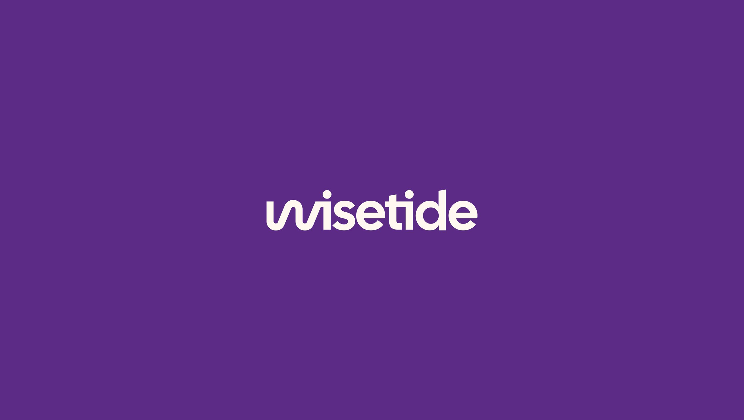
The first layer is the wave. The W is drawn as a fluid, undulating shape that simulates a wave. It is a direct reference to the "tide" in the name. Hear the naming story, then look at the mark. The connection is instant. That is what a strong corporate identity should achieve. Name, story, and symbol reinforce each other.
The second layer is the conductor. The same stroke of the W echoes the movement of a maestro's baton mid-gesture. The metaphor captures what the consultancy does. Like a conductor leading an orchestra, Wisetide aligns its clients' teams. Product, engineering, and leadership start to play in harmony. The mark translates the company's core service: fixing misalignment between functions.
The third layer is the duo. The two letters "i" in the wordmark read as two pictograms of people. They represent the two partners who lead the consultancy. This detail encodes a real differentiator into the logo. Wisetide is not a faceless firm. It is a boutique led by two hands-on partners, one from product and one from engineering. The boutique model is personal, senior, and deeply involved. That is a commercial argument, and the mark makes it visible.
Graphic Elements: A Shape System Derived From the Logo Icon
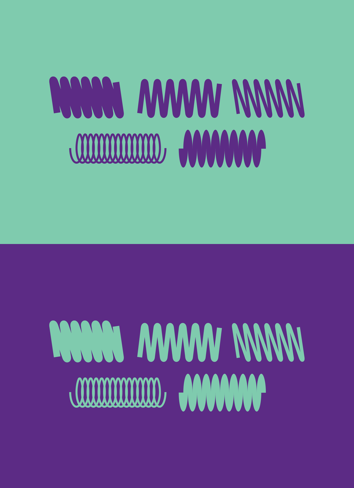
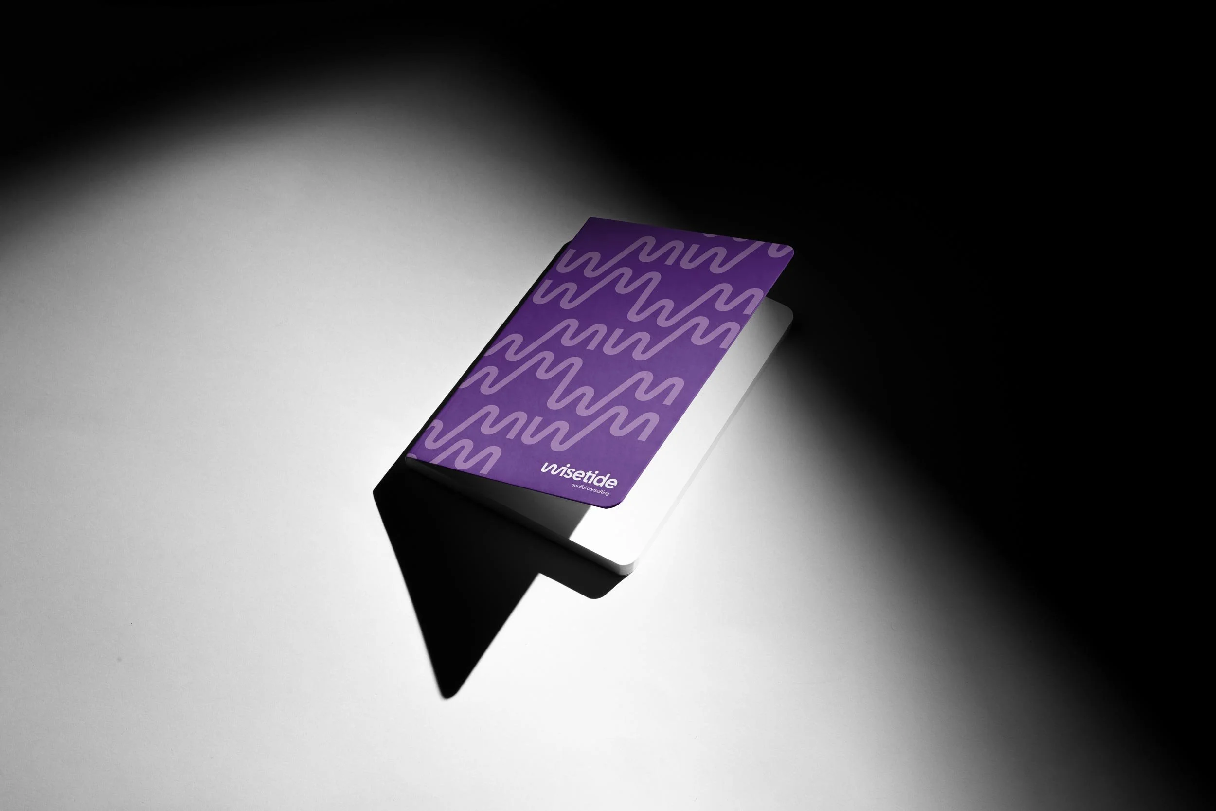
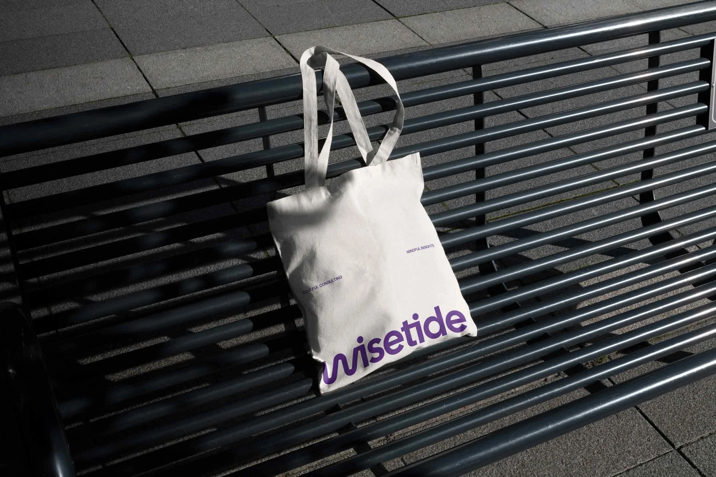
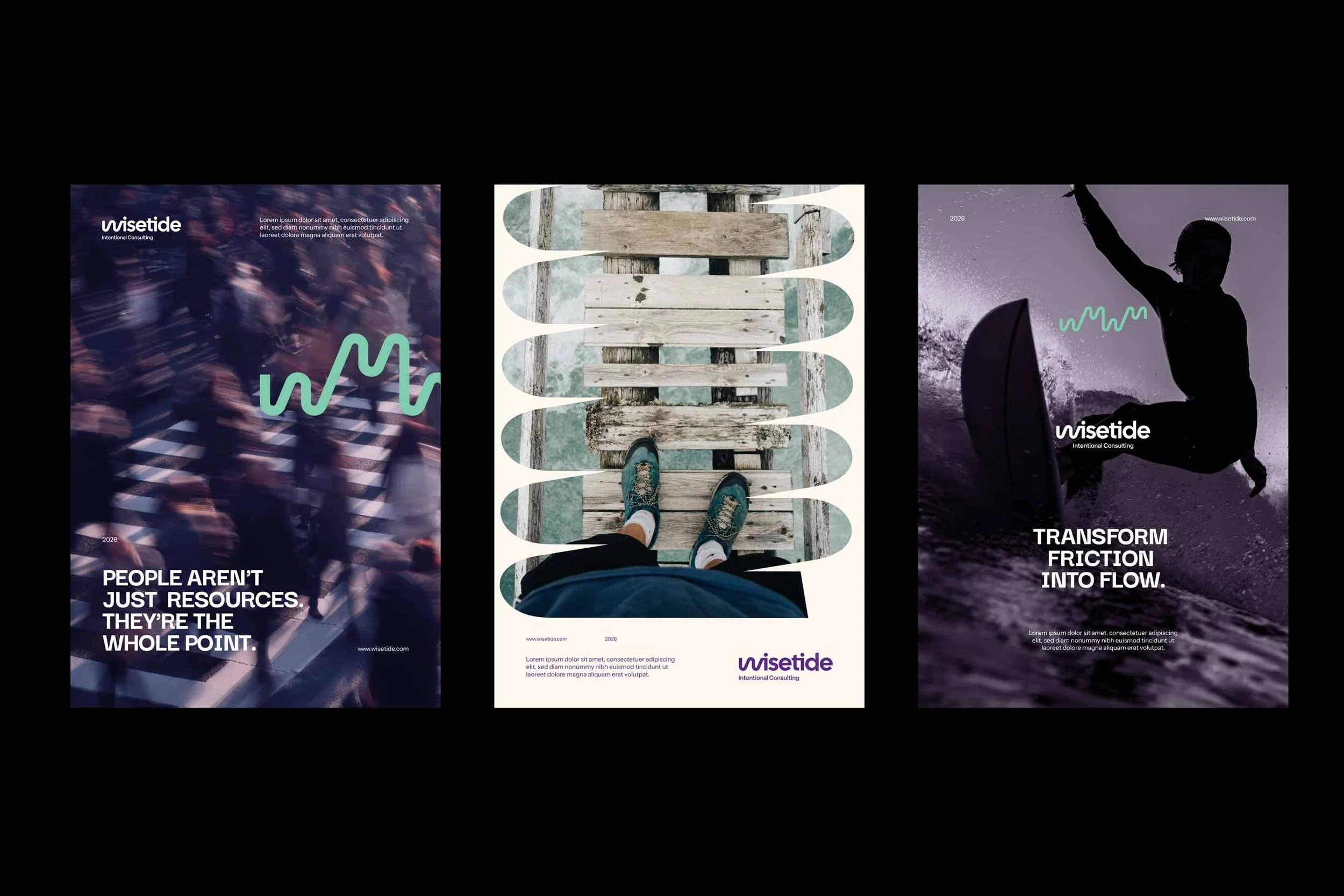
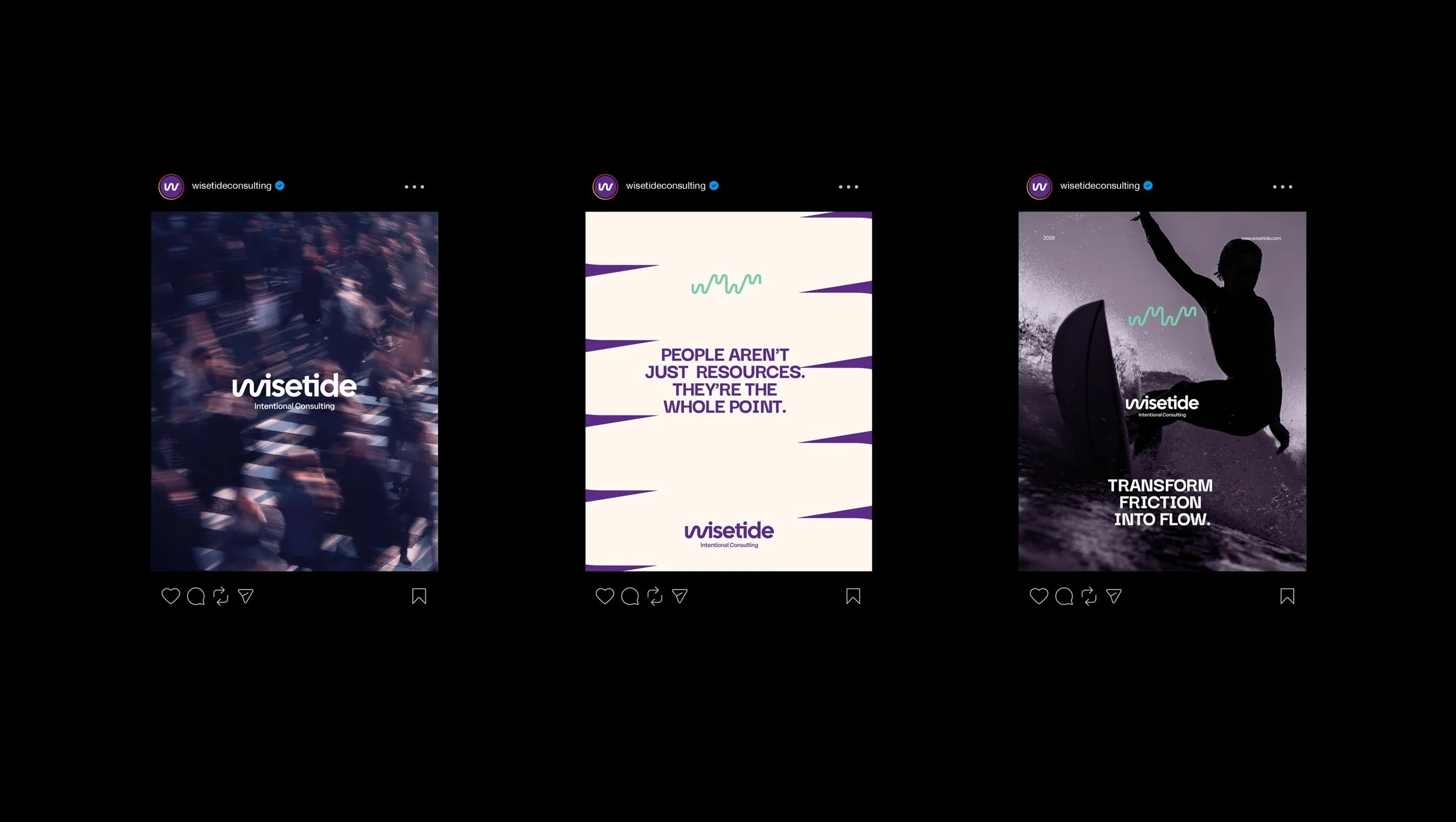
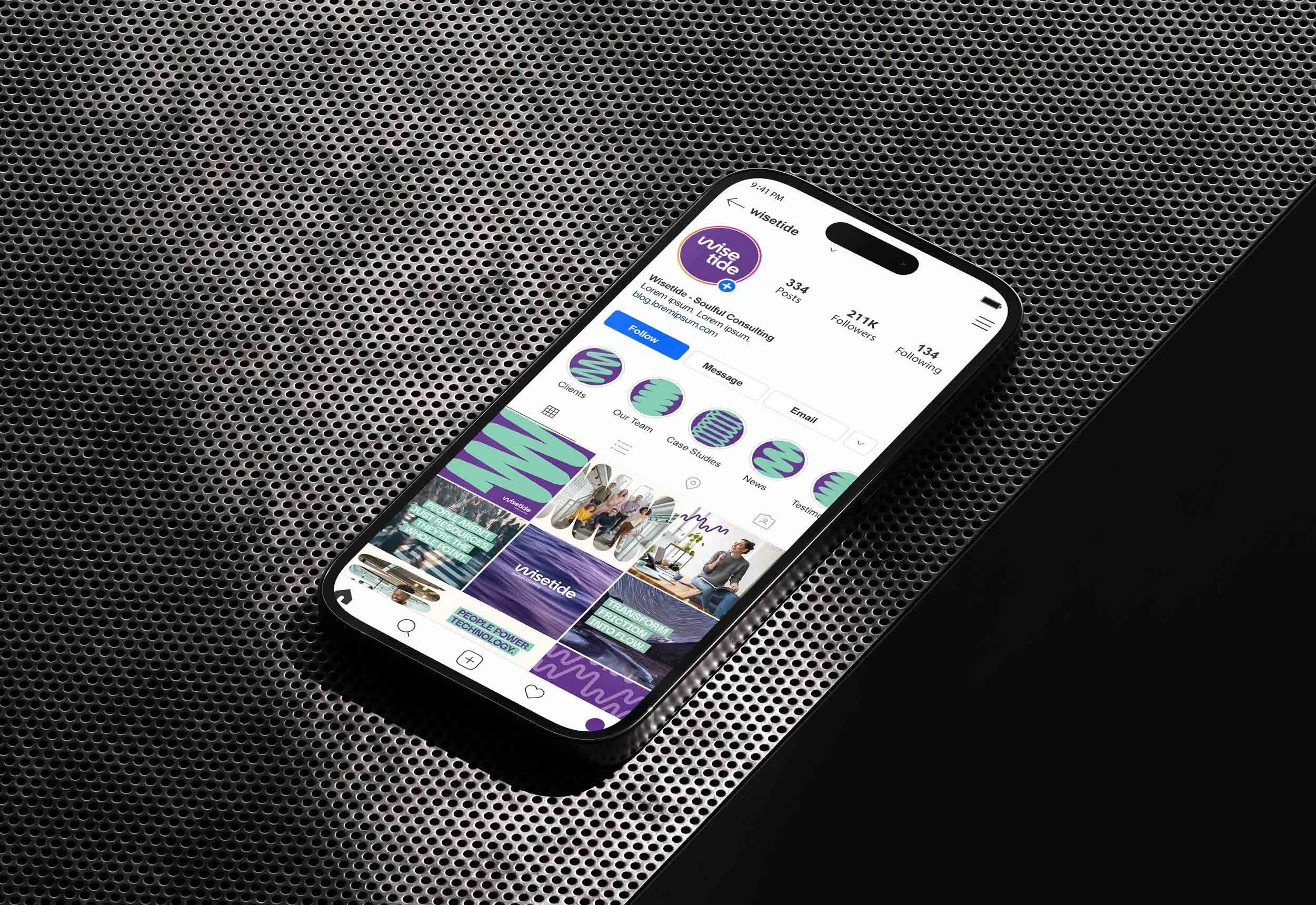
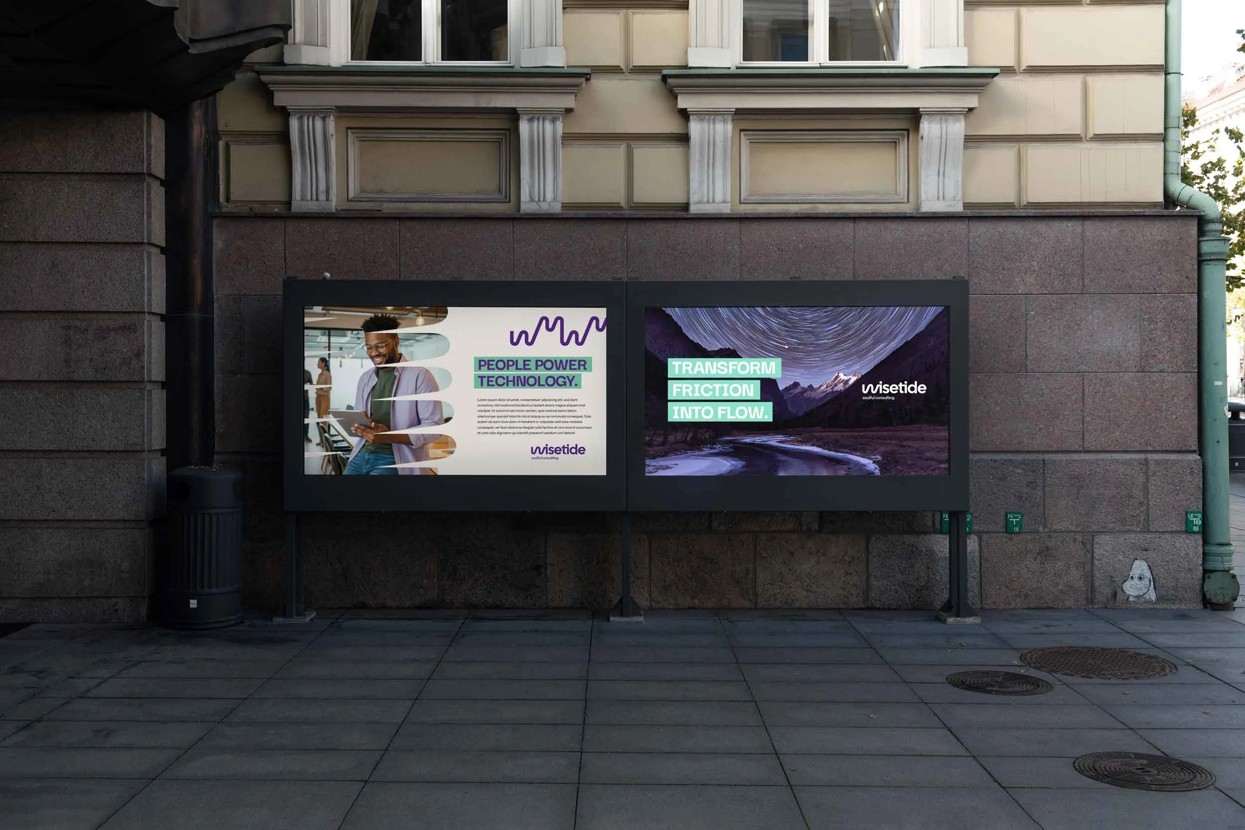
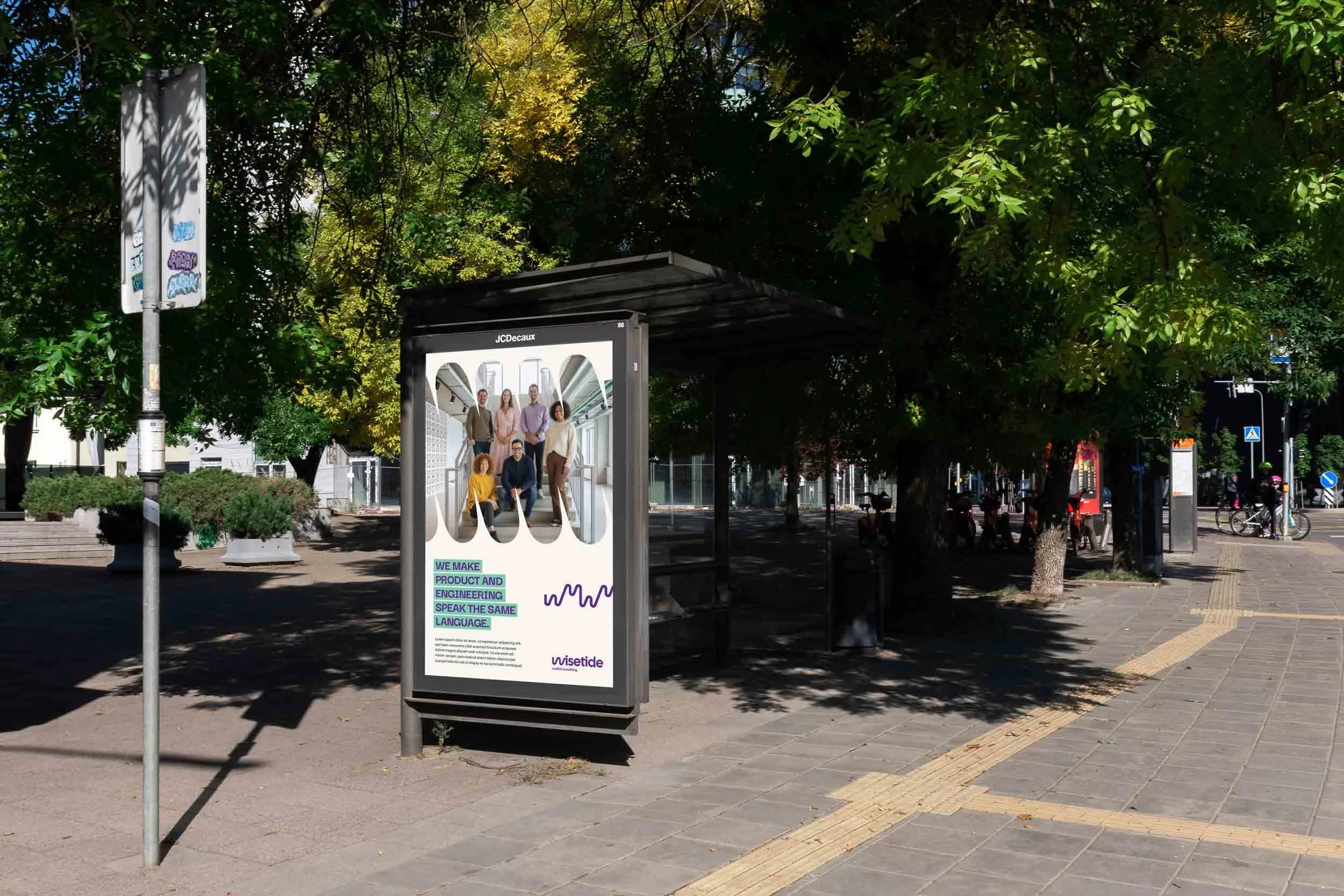
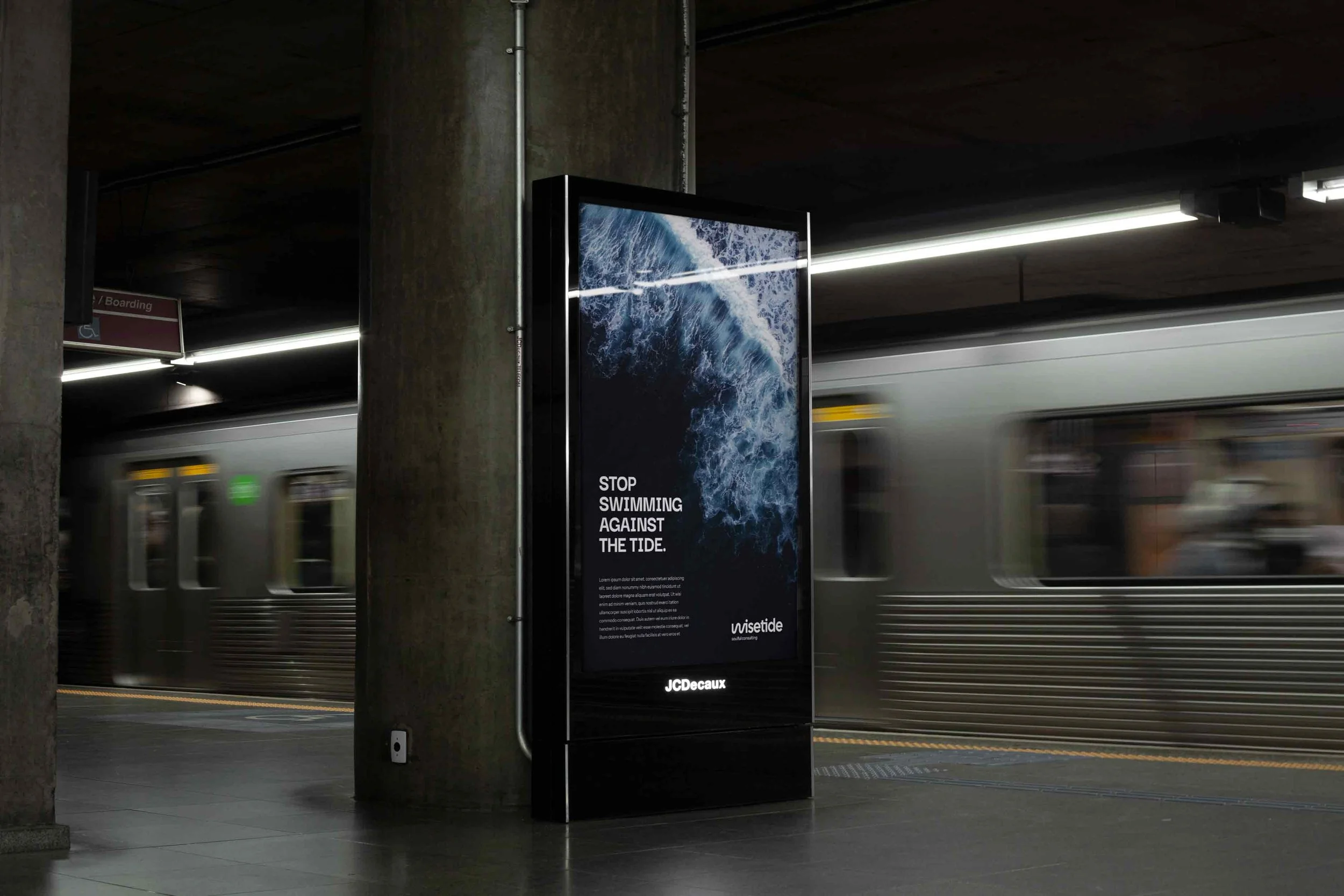
A logo alone does not make a visual identity system. The brand needed a language beyond the mark. So a set of abstract geometric shapes was extracted from the logo icon. These forms work as patterns, frames, and layout devices. They appear across presentations, social media, documents, and the website.
This approach keeps every touchpoint tied to the core symbol. The brand stays recognizable even when the logo is absent. The shape library joins the color rules and the typography system. Together they give the client's team a complete toolkit for on-brand material. The Wisetide Brand Book documents it all, with usage guidelines and common errors to avoid.
Results & Impact: What a Strategy-Led Corporate Identity Achieved
From Invisible to Distinctive: A Brand Ready to Compete in Premium Consulting
At the start, the consultancy was invisible. Expertise without a face. At the end, it had a complete corporate identity. It can stand next to established consulting brands. And it claims a visual and verbal territory none of them own.
The brand launch positioned Wisetide where the strategy intended. A premium boutique alternative, priced and presented as one. For professional services firms, this is the core return on design. A distinct, credible identity supports premium positioning. It shortens the trust-building phase with prospects. And it starts building brand equity from the first touchpoint.
Coherence Across Every Touchpoint: Strategy Reflected in Name, Voice, and Visuals
The most measurable quality of the final identity is coherence. The People First belief lives in the tide metaphor of the name. The Sage archetype lives in the "wise" wordplay. The service itself lives in the conductor gesture of the W. The leadership duo lives in the two human pictograms of the letters "i". The Rebel voice lives in a color palette that refuses to follow the category.
Nothing in the system is decorative. That is what separates corporate identity design from logo design as a commodity. Every element earns its place by expressing the strategy. The brand becomes easier to manage, easier to recognize, and harder to copy.
Key Takeaways for Companies Considering Corporate Identity Design
Are you a founder or marketing leader evaluating brand identity services? The Wisetide case offers four practical lessons:
Strategy before design. The logo took its meaning from research and positioning, not from taste. Agencies that start with visuals answer the question before understanding it.
Differentiation is found in research. The unexplored color territory and the People First position both came from competitor analysis, not from creative intuition alone.
A name can carry the whole strategy. Wisetide compresses the brand's entire argument into one word. That multiplies the value of every future marketing investment.
Boutique can be a strength. The brand encoded the two-partner model into the logo itself. A perceived limitation became a differentiator.
Is your company entering a competitive B2B market in tech, consulting, or professional services? Then this is the standard a corporate identity project should meet. A system where name, voice, and visuals argue the same case.
Want to see the same method applied to a tech product? Explore our SaaS branding case study.
Frequently Asked Questions
-
Pricing depends on scope, agency seniority, and market. A logo-only job costs far less than a complete corporate identity. The difference lies in the depth of research and the range of deliverables. For B2B companies in premium segments, the better question is return on design. A strategy-led identity supports higher pricing, stronger recall, and faster trust with buyers. That value tends to outweigh the difference in investment. Request detailed proposals with a clear scope of work. Then compare what is actually being delivered.
-
The terms overlap and people often use them as synonyms. So a quick note helps. Corporate identity refers to how a company presents itself as an organization. That means name, logo, visual system, and formal communications. Brand identity is broader. It covers everything that shapes perception, including personality, tone of voice, messaging, and experience. Modern projects like Wisetide merge both. The strategy defines the brand identity. The visual and verbal system expresses it as a corporate identity. When hiring, make sure the agency delivers both layers connected. A logo detached from strategy is not enough.
-
A complete corporate identity project starts with brand strategy. That covers positioning, values, personality, and tone of voice. It includes naming when the company needs one. Then comes logo design with all lockups and color variations. The package adds a color palette, a typography system, and graphic elements. Business items follow: email signatures, document templates, and slide decks. A social media kit, website guidelines, and a brand book close the scope. The Wisetide project delivered all of these in a single structured engagement.
-
Timelines vary with scope. A full project with research, strategy, naming, and visual identity takes two to four months in most cases. The Wisetide engagement ran about eight weeks across four stages. Those were research and discovery, brand strategy, naming, and identity design, followed by final delivery. Projects without a naming stage tend to be shorter. Identities with many applications or extra stakeholder rounds take longer.
Ready to start a new project?
Drop us a message to schedule a meeting or request a customized quote. We'd love to hear more about challenges.