
Coffee Shop Branding That Drives Growth: Reboot Cafe Case Study
CLIENT: REBOOT CAFE
YEAR: 2020
SERVICES: BRAND STRATEGY | NAMING | BRAND IDENTITY DESIGN | PACKAGING DESIGN
FEATURED ON: WORLD BRAND DESIGN SOCIETY, PACKAGING OF THE WORLD
If your coffee brand is not standing out on the shelf or charging premium prices, the problem is rarely the product. In most cases, the issue is branding.
In a saturated specialty coffee market, customers don’t just buy coffee. They buy perception, experience, and identity. This case study shows how a strategic coffee shop branding approach helped position Reboot Cafe as a premium brand through clarity, minimalism, and consistency.
You’ll see how brand strategy, logo design, and packaging design work together to increase perceived value, attract the right audience, and support long-term growth.
Project Overview: Reboot Cafe Brand Identity
Brand Background and Business Objectives
Reboot Cafe was created with a clear vision: build a coffee brand centered on clarity, quality, and simplicity.
The challenge was not just to design a visually appealing identity, but to create a positioning strong enough to compete in a crowded hospitality market. Many competitors rely on rustic, vintage, or highly detailed aesthetics. While popular, these approaches often blur together on the shelf.
The goal was to take a different direction:
Build a premium perception through minimalism
Create a distinctive and modern brand identity
Develop a system that works across packaging, space, and digital
This project shows how strategic branding decisions can directly influence how a product is perceived and valued.
Target Audience and Market Positioning
The brand was designed for consumers who value specialty coffee, detail, and refined experiences.
This audience:
Pays attention to presentation and consistency
Associates simplicity with quality
Is willing to pay more for brands that feel intentional
Instead of competing on price, the strategy positioned Reboot Cafe in the premium segment through perception.
Minimalism was not just an aesthetic choice. It was a positioning tool.
By removing excess and focusing on essentials, the brand communicates confidence, control, and quality, key drivers in consumer decision-making.
Branding Goals and Strategic Direction
The entire project was guided by three strategic objectives:
Create a distinct and recognizable coffee shop brand identity
Communicate quality through simplicity and precision
Build a flexible visual system for multiple touchpoints
These goals ensured that every design decision supported business outcomes, not just visual preference.


Brand Strategy Behind the Visual Identity
Translating Brand Values into Visual Language
The core brand values — simplicity, precision, and energy — were translated into a clear visual system.
Minimalist branding was used intentionally. Not as a trend, but as a strategic choice to signal:
Control
Attention to detail
Product confidence
Every visual element was reduced to its essential function. This increases clarity and improves how quickly customers understand the brand.
Aligning Branding with Customer Expectations
In the specialty coffee market, perception is shaped by detail.
Customers expect:
Clean design
Clear information
Consistent presentation
The visual identity reflects these expectations through balance, spacing, and restraint. There are no unnecessary elements competing for attention.
This alignment between expectation and execution builds trust — a key factor in premium positioning.
Creating a Premium Brand Positioning
Premium brands are not defined by complexity. They are defined by clarity and intention.
In this project, minimalism reinforces value by:
Highlighting what matters
Removing visual noise
Creating a more refined experience
Compared to competitors using overloaded designs, this approach creates immediate differentiation at the point of sale.


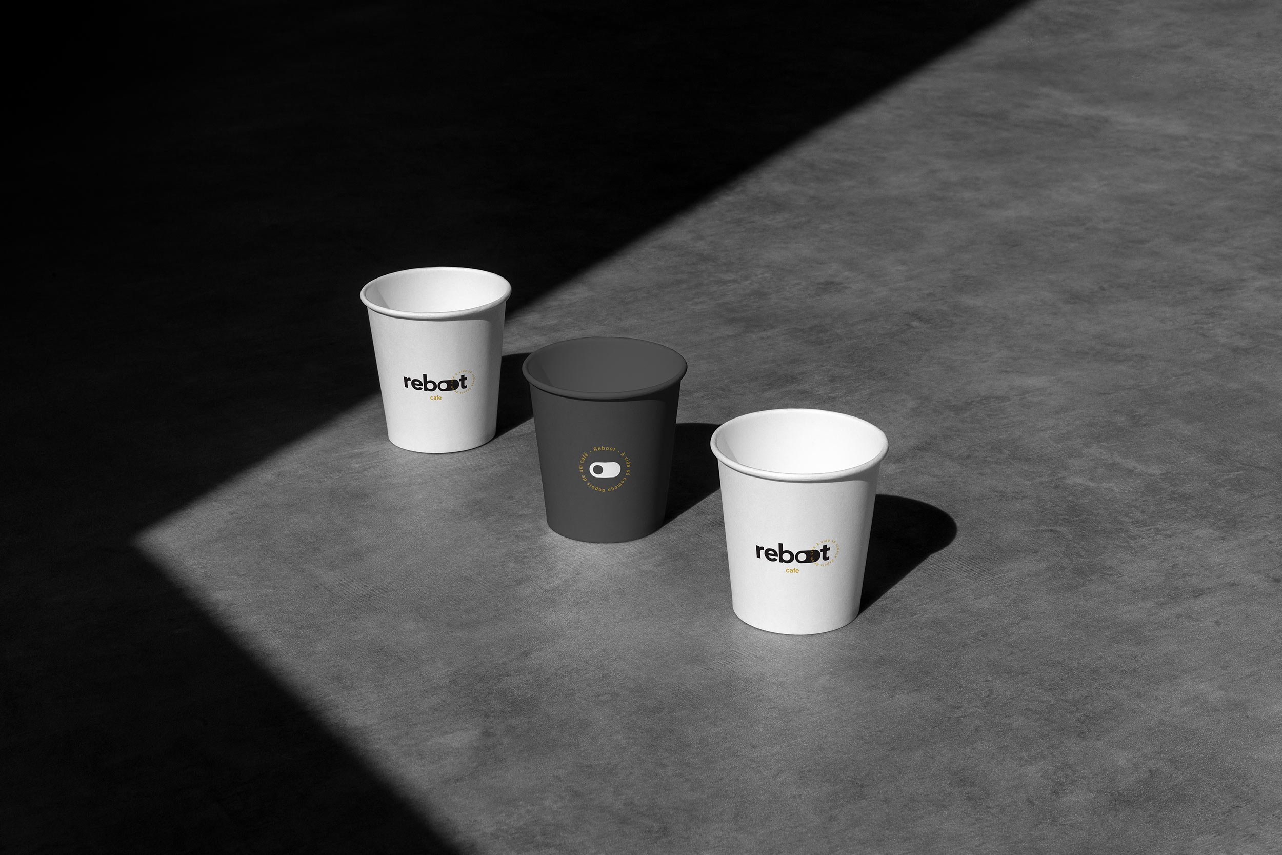
Coffee Shop Logo Design: Concept and Execution
The Strategy Behind the Symbol
The logo is based on a switch button symbol — a direct reference to activation and energy.
This concept connects to the functional benefit of coffee: turning on, starting, boosting.
At the same time, it avoids overused industry clichés like coffee beans or cups. This makes the brand more distinctive and easier to recognize.
Minimalist Logo Design Principles
The logo follows key principles of high-performance identity systems:
Simple geometry
Strong contrast
Minimal elements
This ensures:
High recognizability at any size
Strong visibility in both print and digital
Long-term usability across applications
In professional logo design, simplicity is not a limitation. It is what makes a brand scalable.
Logo Versatility Across Touchpoints
The logo was designed as a flexible system, not a static element.
It adapts across:
Packaging
Signage
Social media
Brand materials
This consistency strengthens brand recognition and reduces friction across customer interactions.
Cafe Brand Identity System and Visual Language
Black and White Color Strategy
The decision to use a black and white palette was strategic.
This approach:
Creates strong contrast
Improves readability
Eliminates distractions
In a crowded visual environment, simplicity increases impact.
It also reinforces a timeless aesthetic, avoiding trends that age quickly.
Typography and Layout System
Typography plays a central role in clarity.
The type system was selected for:
Legibility
Balance
Modern tone
Combined with a structured layout system, it ensures that all communication is easy to scan and understand.
This is critical in environments where customers make quick decisions.
Consistency Across Brand Applications
Consistency is one of the strongest drivers of brand trust.
Every touchpoint follows the same visual logic:
Menus
Packaging
Printed materials
Digital assets
This repetition builds familiarity, which directly impacts customer preference over time.


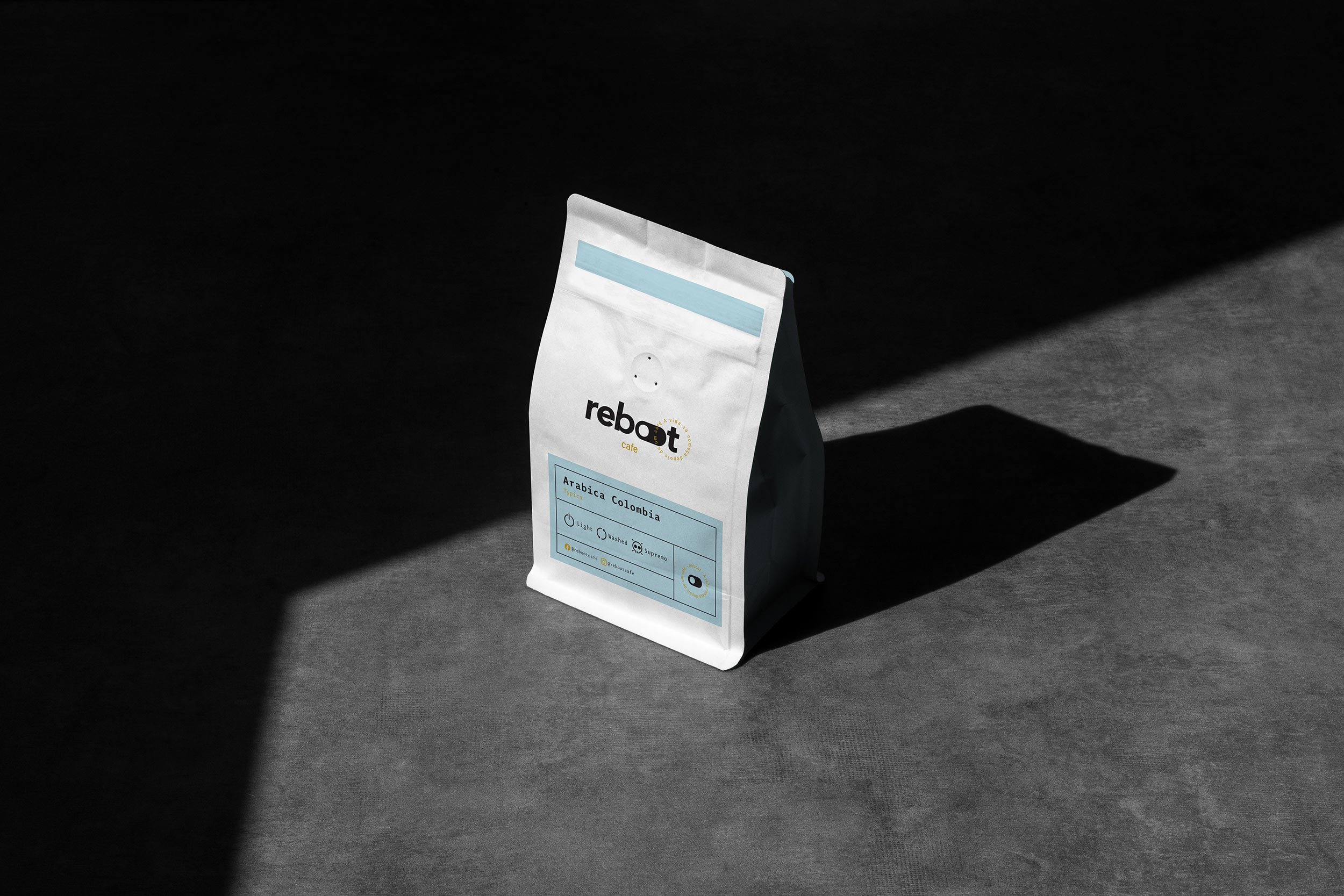
Packaging Design for Coffee: Driving Perceived Value
Minimalist Packaging as a Competitive Advantage
Packaging is often the first physical interaction with the brand.
While many coffee brands rely on complex visuals, Reboot Cafe uses reduction as a strategy.
The result:
Higher contrast on the shelf
Faster recognition
Stronger premium perception
This difference is critical in competitive retail environments.
Materials, Finishes, and Perception
Perceived value is not just visual. It is also tactile.
The choice of materials and finishes communicates quality before the product is even consumed.
High-quality substrates and refined finishes create a more elevated experience, influencing how customers judge the product.
Packaging and Customer Experience
Good packaging balances function and communication.
In this project, the design:
Makes information easy to read
Reinforces brand identity
Enhances the unboxing experience
This creates a stronger emotional connection with the customer.
Business Impact of Strategic Coffee Shop Branding
Increased Attractiveness and Engagement
A clear brand is easier to notice and understand.
By simplifying the visual language, the brand becomes more accessible and engaging. Customers can quickly identify what it stands for.
This improves first impressions and increases interaction.
Higher Perceived Value and Pricing Power
Branding directly affects how much customers are willing to pay.
Through minimalist design and consistent execution, the brand signals higher quality. This supports premium pricing without relying on discounts.
Stronger Brand Loyalty Over Time
Consistency builds recognition. Recognition builds trust.
When customers repeatedly encounter a clear and cohesive brand, they are more likely to choose it again.
Over time, this leads to:
Repeat purchases
Stronger brand recall
Long-term customer relationships


Why Invest in Professional Coffee Shop Branding Services
What a Strategic Branding Process Includes
Professional coffee branding goes beyond visual design.
It includes:
Brand positioning
Audience definition
Visual identity systems
Packaging strategy
A structured process ensures that all elements work together to support business goals.
How Branding Creates Competitive Advantage
In crowded markets, products alone are not enough.
Strong branding:
Differentiates your business
Communicates value clearly
Attracts the right audience
Brands that invest in strategy outperform those that rely only on aesthetics.
Ready to Build a Premium Coffee Brand?
If your brand is not attracting the right customers or competing on price instead of value, it may be time to rethink your branding.
A strategic coffee shop brand identity can change how people perceive your product and how much they are willing to pay for it.
Ready to start a new project?
Drop us a message to schedule a meeting or request a customized quote. We'd love to hear more about challenges.
Frequently Asked Questions
-
The cost of coffee shop branding depends on the scope of the project. A complete brand identity typically includes strategy, visual identity, and application systems. Prices vary based on depth, but investing in professional branding often leads to higher perceived value and better long-term returns.
-
A full coffee shop brand identity usually includes logo design, color palette, typography, visual guidelines, and packaging design. In more strategic projects, it also includes brand positioning, messaging, and customer experience direction.
-
A branding project can take anywhere from a few weeks to a few months. The timeline depends on the level of research, strategy, and refinement involved. More in-depth projects tend to produce stronger and more consistent results.
-
Packaging design plays a key role in how customers perceive and choose a coffee product. It communicates quality, builds recognition, and influences purchase decisions at the point of sale. Strong packaging design can significantly increase perceived value and differentiation.