Cookie Branding Case Study: Strategic Rebranding and Packaging Design for Truppe
CLIENT: TRUPPE (FORMERLY AMORE PALHA)
INDUSTRY: ARTISAN BAKERY & GOURMET SWEETS
SERVICES: BRAND STRATEGY, NAMING, VISUAL IDENTITY DESIGN, PACKAGING DESIGN
LOCATION: PELOTAS - BRAZIL
YEAR: 2025
Overview: From Product-Led Business to Scalable Cookie Brand
This cookie branding case study explores how Truppe evolved from a product-focused bakery into a scalable cookie brand through strategic food branding, visual identity design, and packaging systems built for growth.
The project demonstrates how a strong brand system can improve retail performance, strengthen brand recognition, and prepare a gourmet sweets business for long-term expansion.
The Challenge: Scaling a Cookie and Bakery Brand Beyond a Single Product
Originally named Amore Palha, the brand was deeply associated with a single product: Italian-style palha italiana.
While the product was successful, this positioning limited brand growth.
As the business expanded into cookies, brownies, and other gourmet sweets, the name and identity no longer supported the brand’s ambitions.
Key Branding Challenges
Brand name tied to a single product
Weak and inconsistent cookie branding system
Visual identity not scalable across categories
Limited brand recognition beyond the flagship item
Food packaging with low shelf impact
To compete in a growing gourmet sweets market, the business needed a flexible brand name, clear positioning, and a strong cookie branding and food packaging system.
Strategic Goals: Building a Strong Cookie Branding Foundation
The rebranding project focused on creating a solid, future-proof foundation through strategic cookie branding and food branding.
Main Objectives
Create a scalable and versatile brand name
Develop a distinctive visual identity for bakery and cookie brands
Design retail-ready food packaging with strong shelf visibility
Position Truppe as an innovative yet accessible cookie brand
Preserve emotional connections with existing customers
Market Research & Food Branding Insights
Market research revealed a clear opportunity.
The local bakery and gourmet sweets market invested very little in professional food branding and packaging design, creating space for differentiation.
Key Consumer Insights
High perceived product quality
Strong emotional connection to the brand
Sense of indulgence and comfort
Appreciation for visual appeal
Excellent value perception
At the same time, the gourmet sweets segment was growing faster than traditional confectionery. This made it the ideal moment to position Truppe as a modern cookie brand with strong retail presence and visual impact.
Brand Strategy & Positioning for a Modern Cookie Brand
Using Simon Sinek’s Golden Circle, the brand strategy was clearly defined.
Purpose
To spread joy through a genuine love for sweet moments.
Brand Positioning
An innovative and accessible cookie brand that transforms everyday treats into shared moments of happiness.
This positioning placed Truppe between traditional bakeries and premium gourmet brands—modern, friendly, and approachable.
Naming Strategy: From Product Name to Scalable Cookie Brand
Choosing the right name was one of the most strategic decisions in the project.
Why “Truppe”?
Inspired by the idea of a group (“troupe”) creating joy together
Influenced by the Italian expression “è troppo!”
Easy to pronounce and remember
Not tied to a single product category
Most importantly, Truppe supports long-term cookie branding and food branding expansion, allowing the brand to grow across products, channels, and markets.

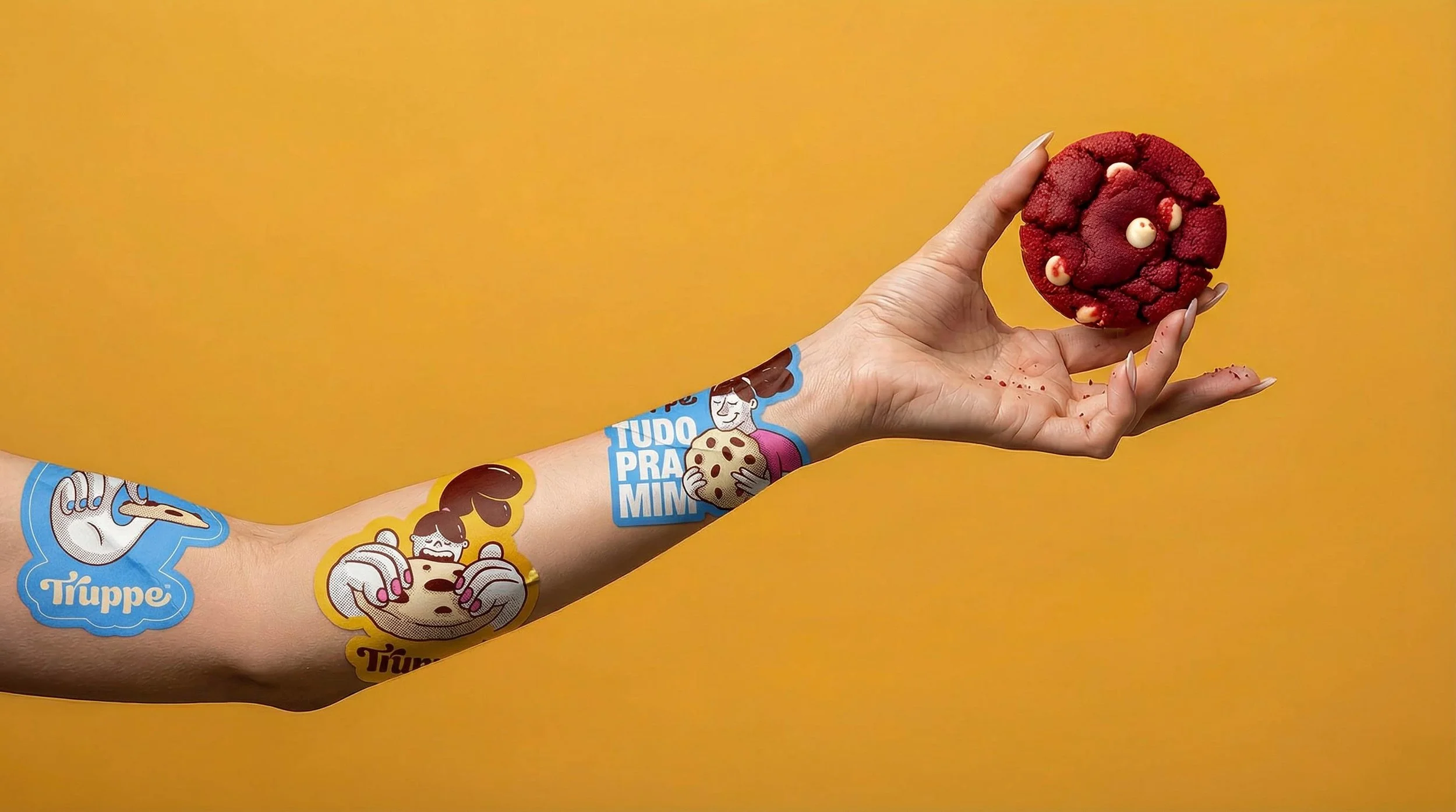
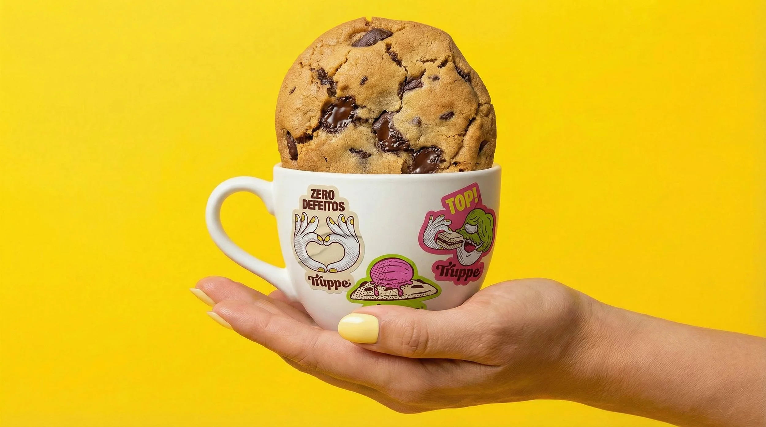
Visual Identity Design for Bakery and Cookie Brands
The visual identity translated strategy into a clear, scalable brand system.
Key Visual Identity Elements
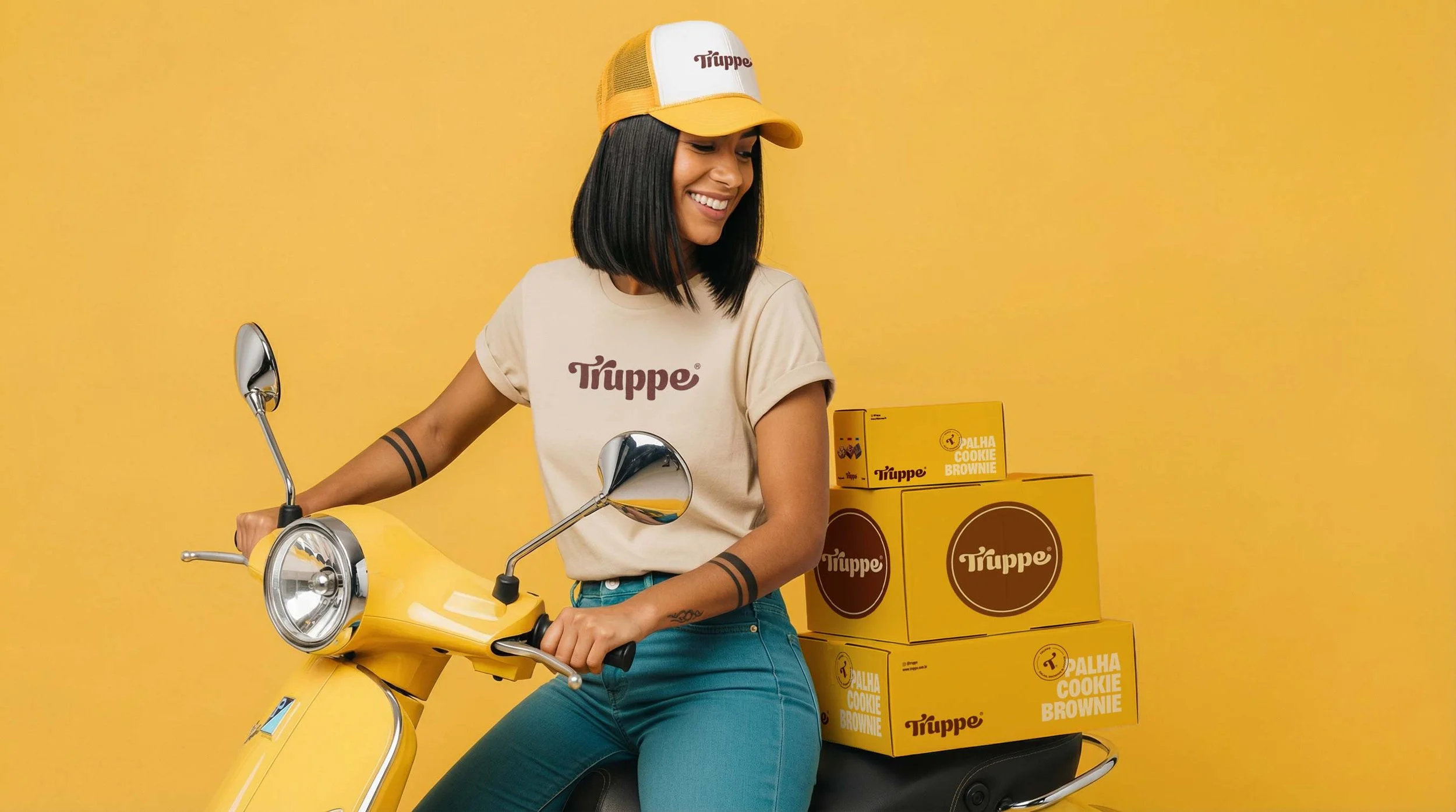
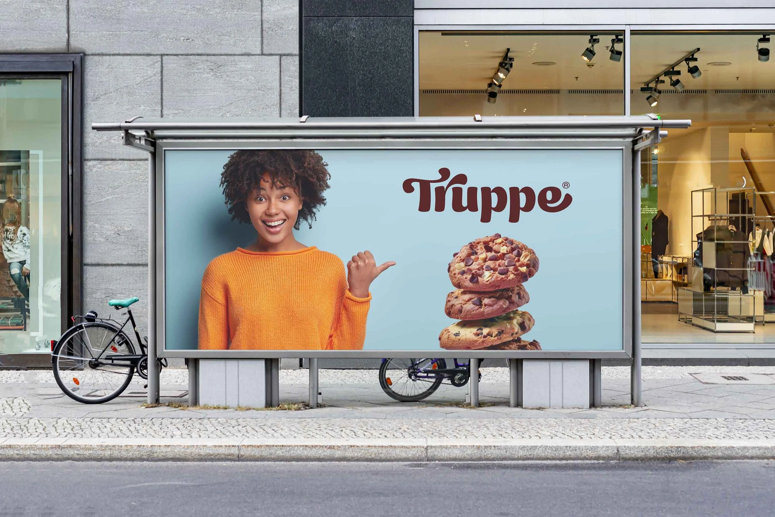
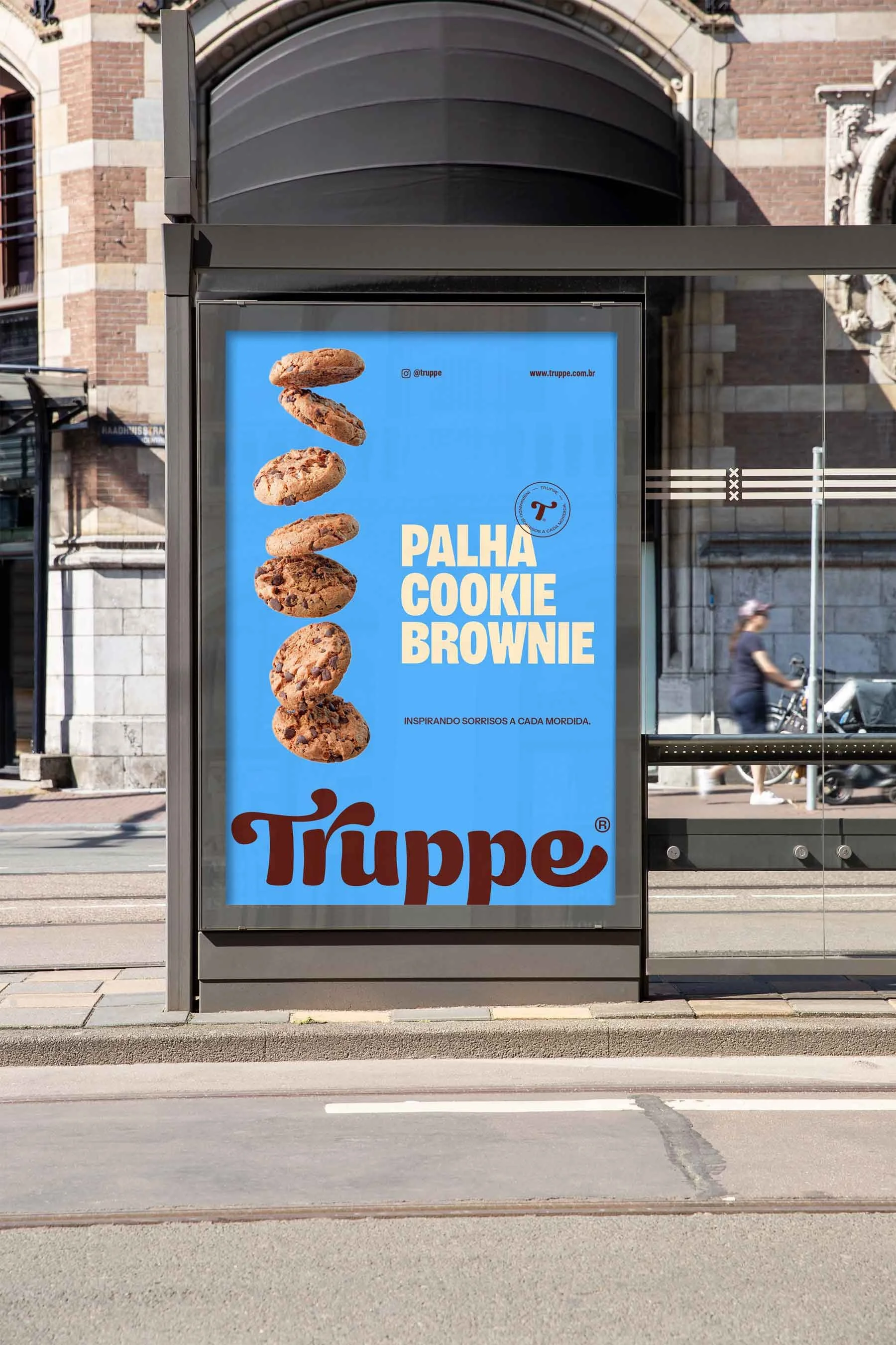
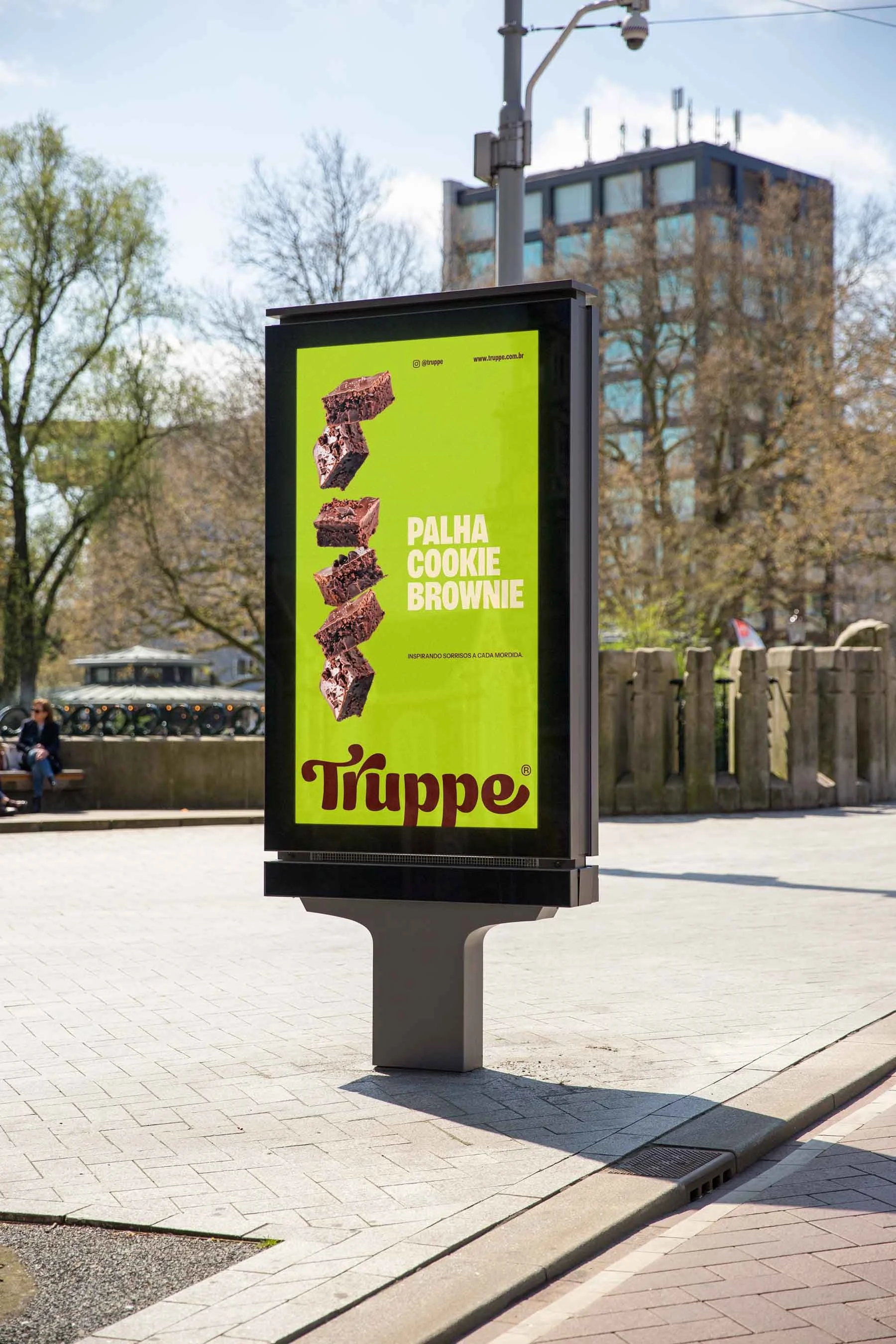
Bold custom logo designed for shelf impact
Bright color system for fast flavor recognition
Clear, legible typography for print and digital use
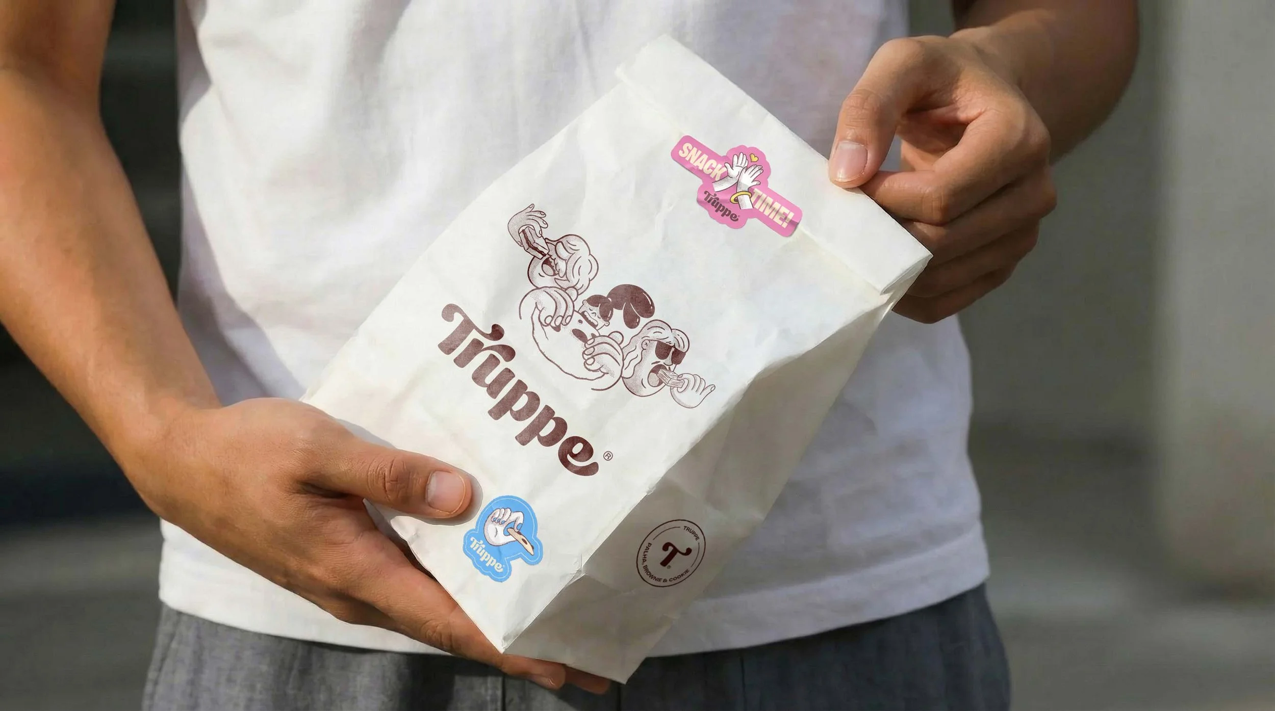
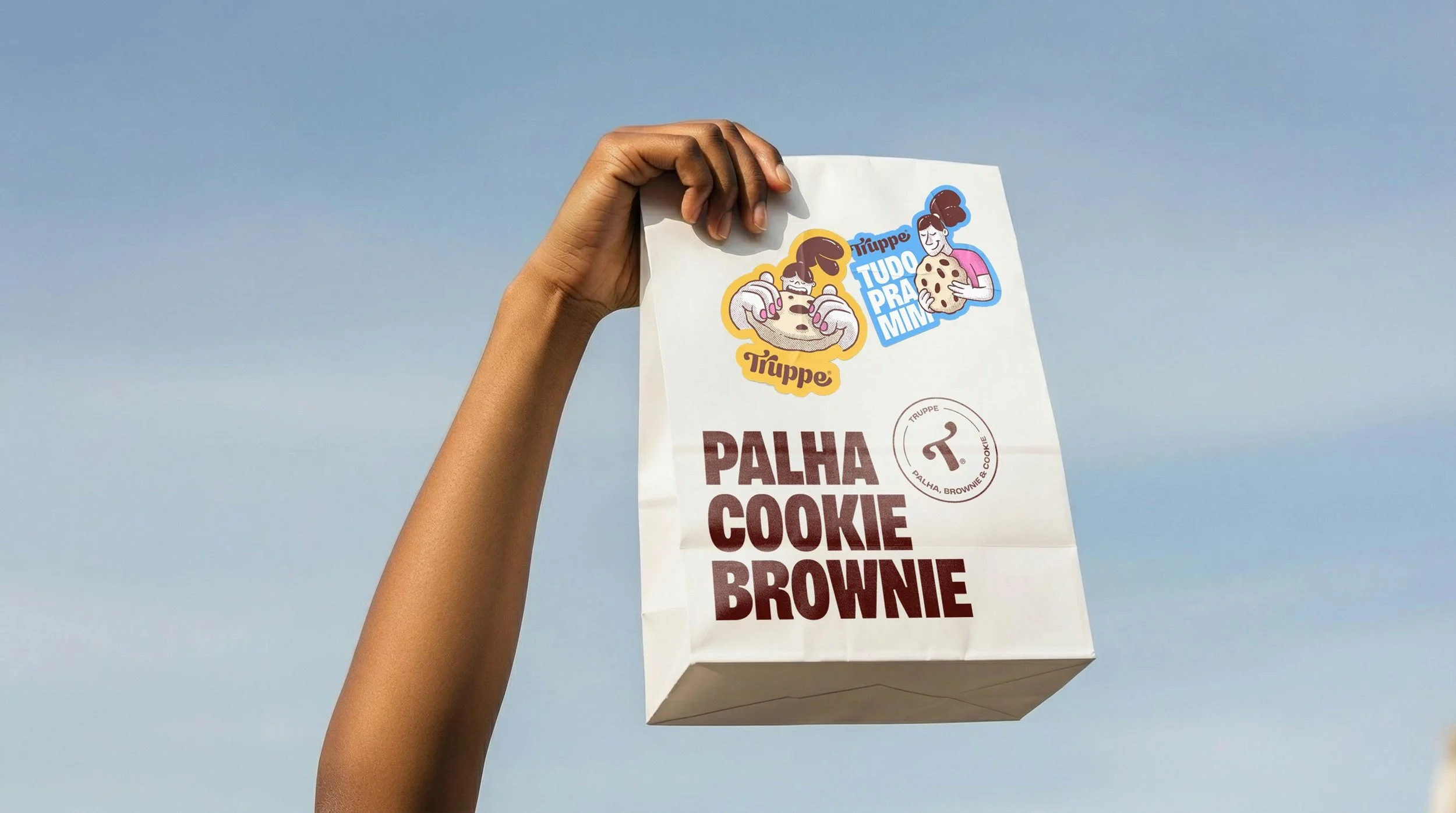
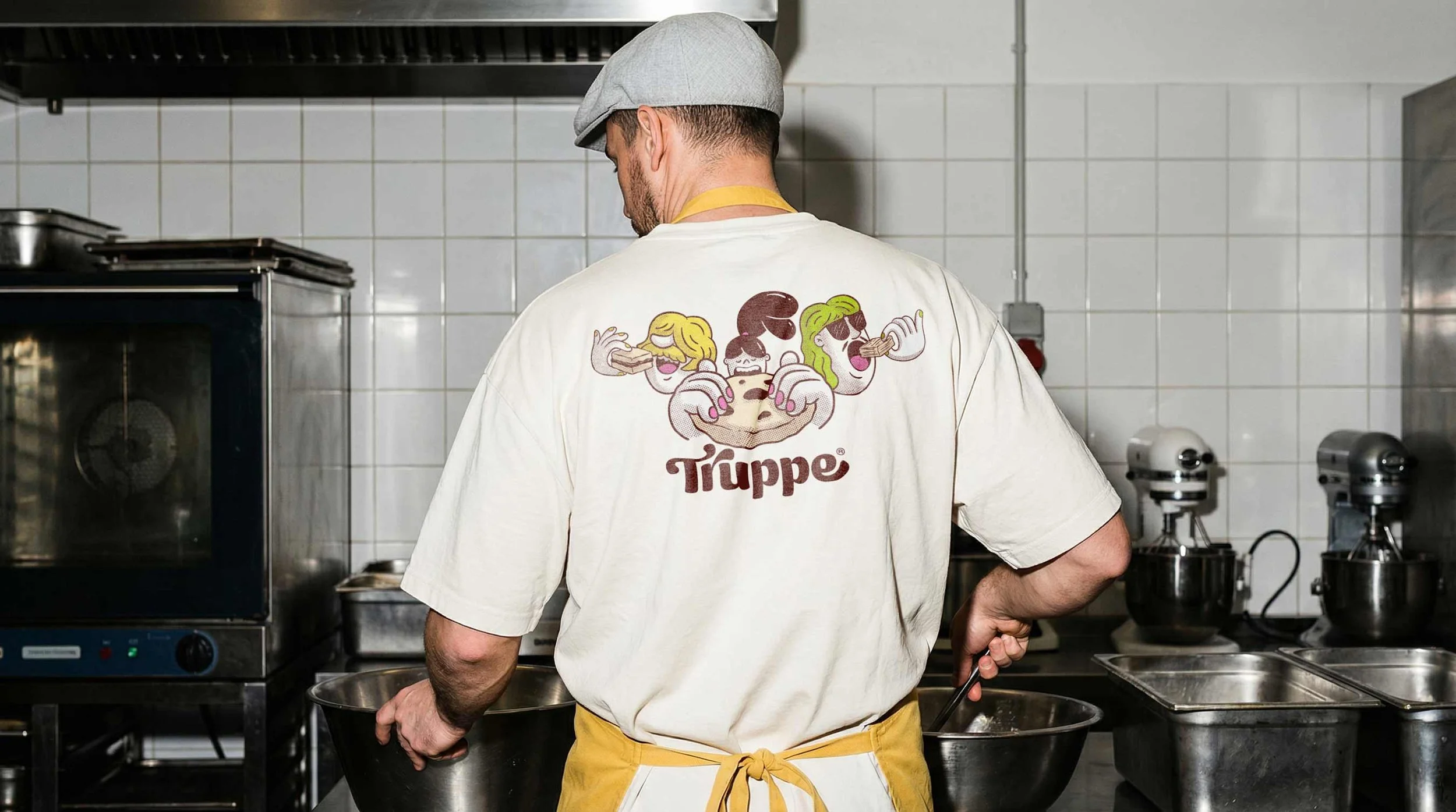
Custom illustrations for each product category
For cookies, a dedicated illustration system was created to enhance memorability and brand recognition, an uncommon but highly effective approach in the local bakery market.
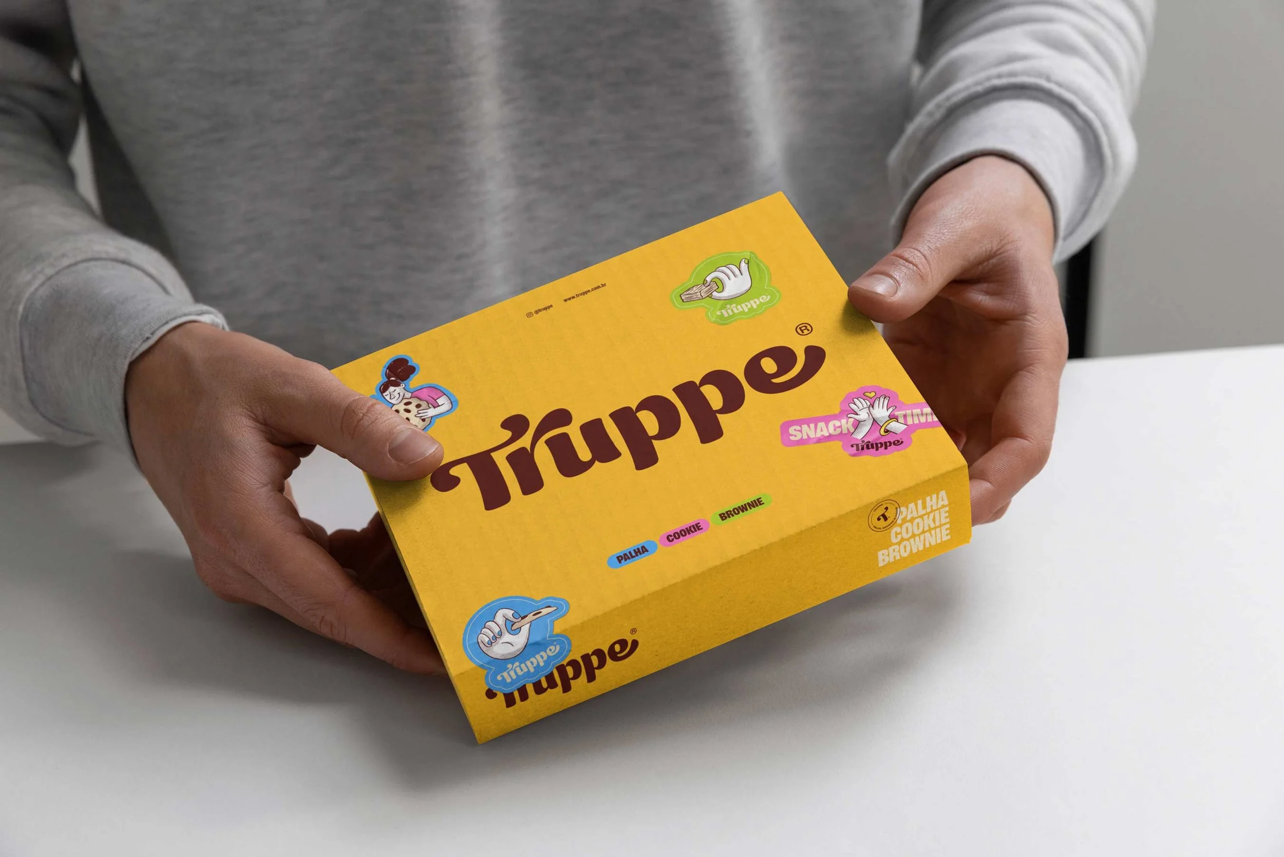
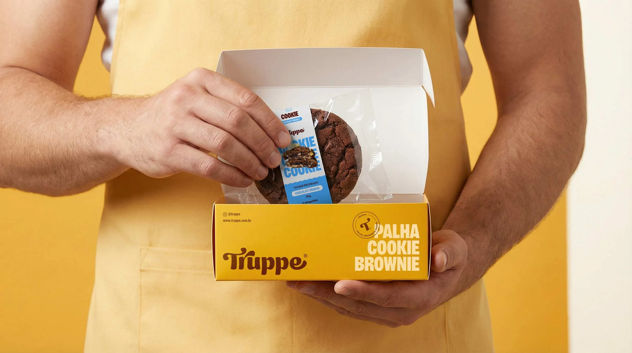
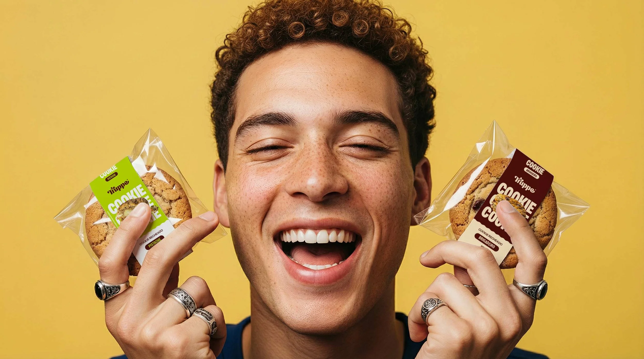
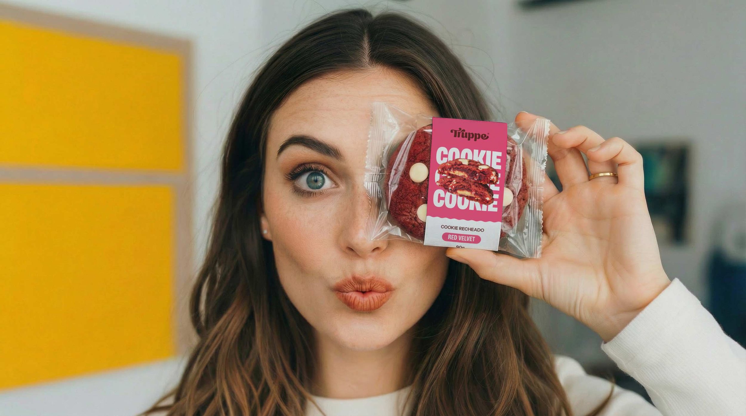
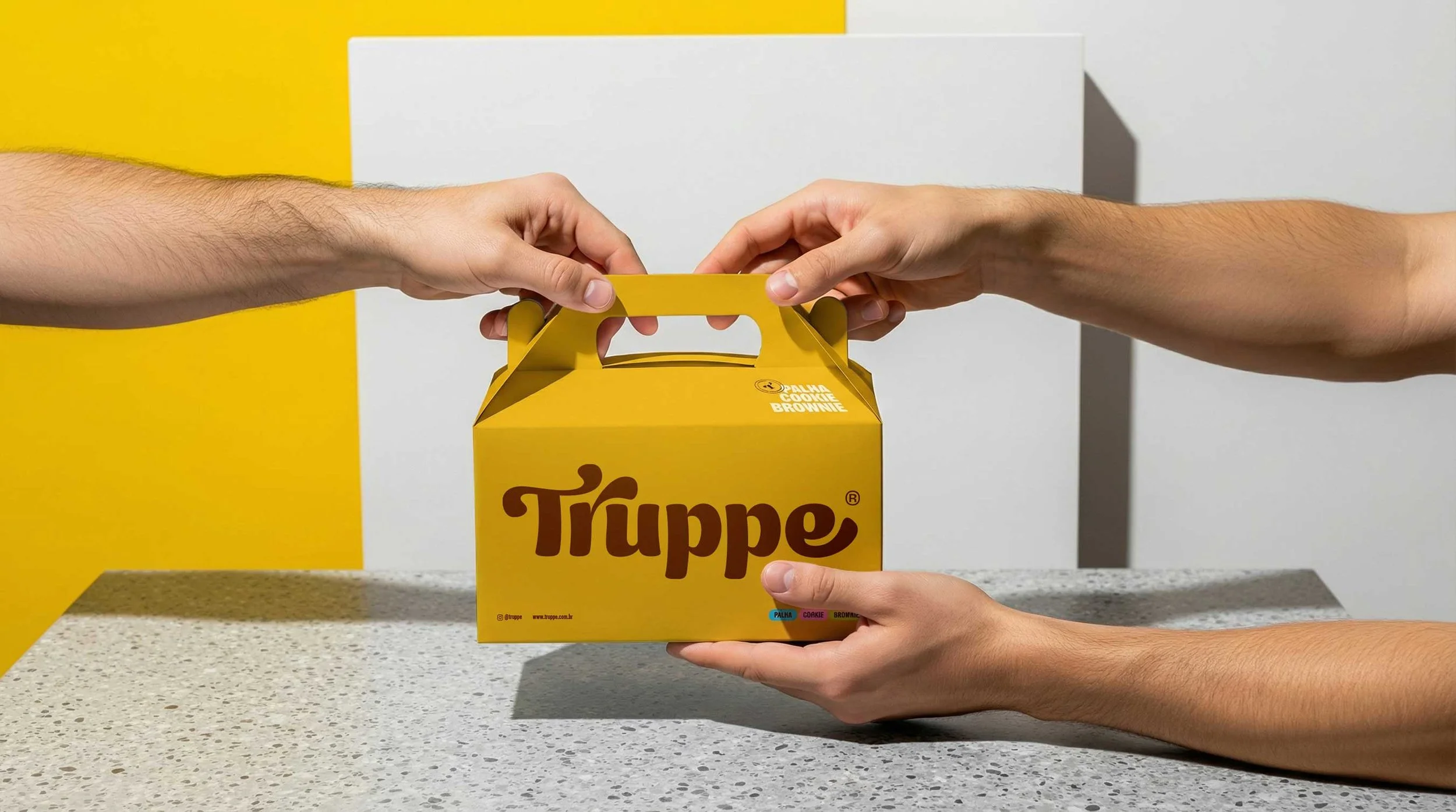
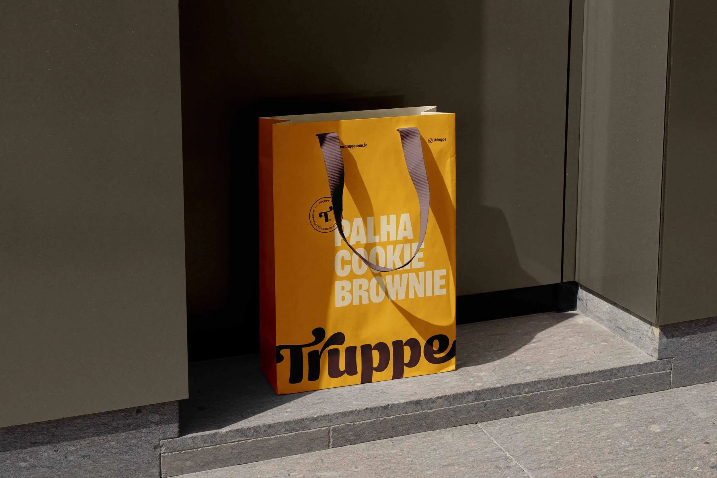
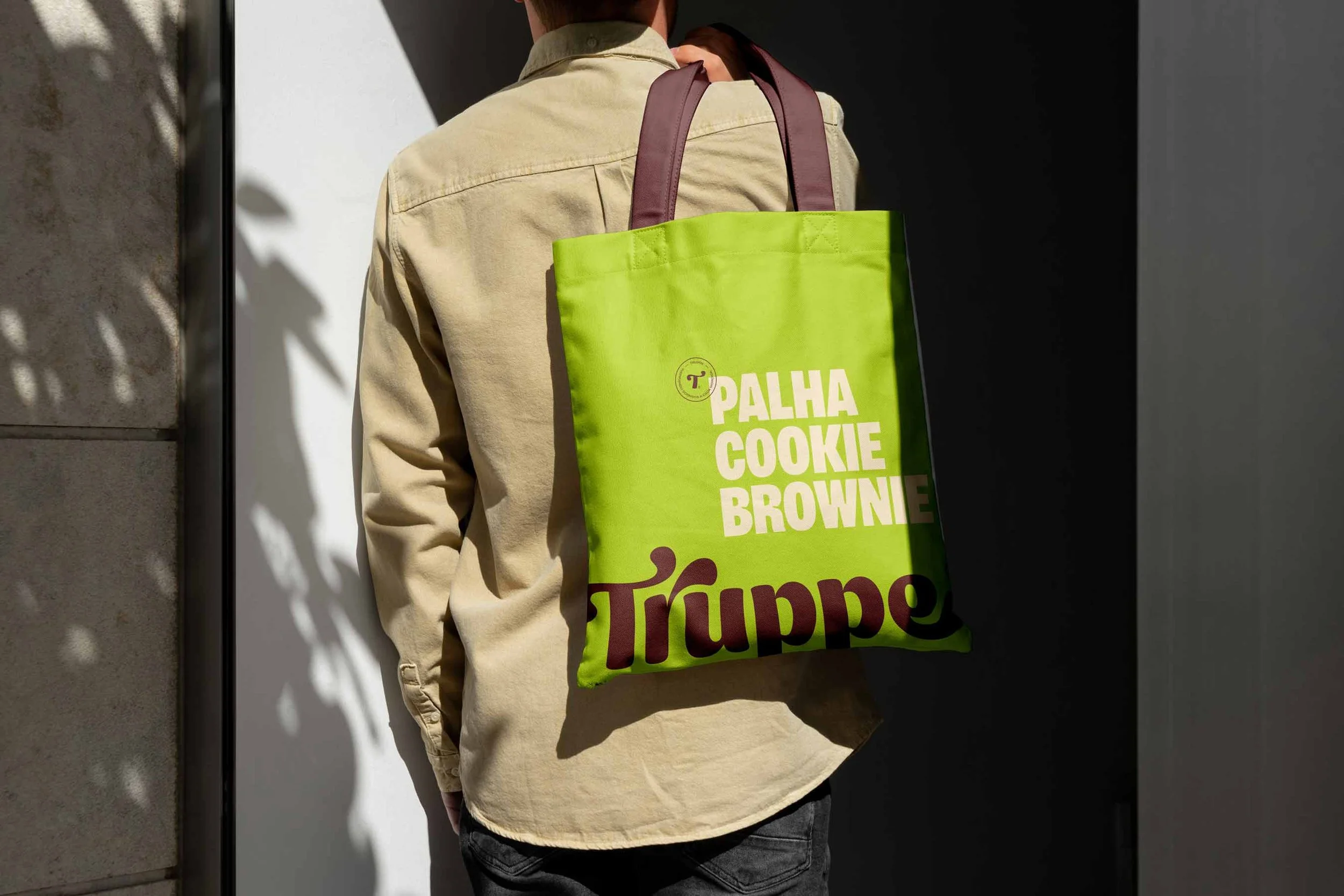
Food Packaging Design for Cookie Brands: The Silent Salesperson
Packaging design was a top priority.
In food branding, packaging is often the first and most powerful point of contact between brand and consumer.
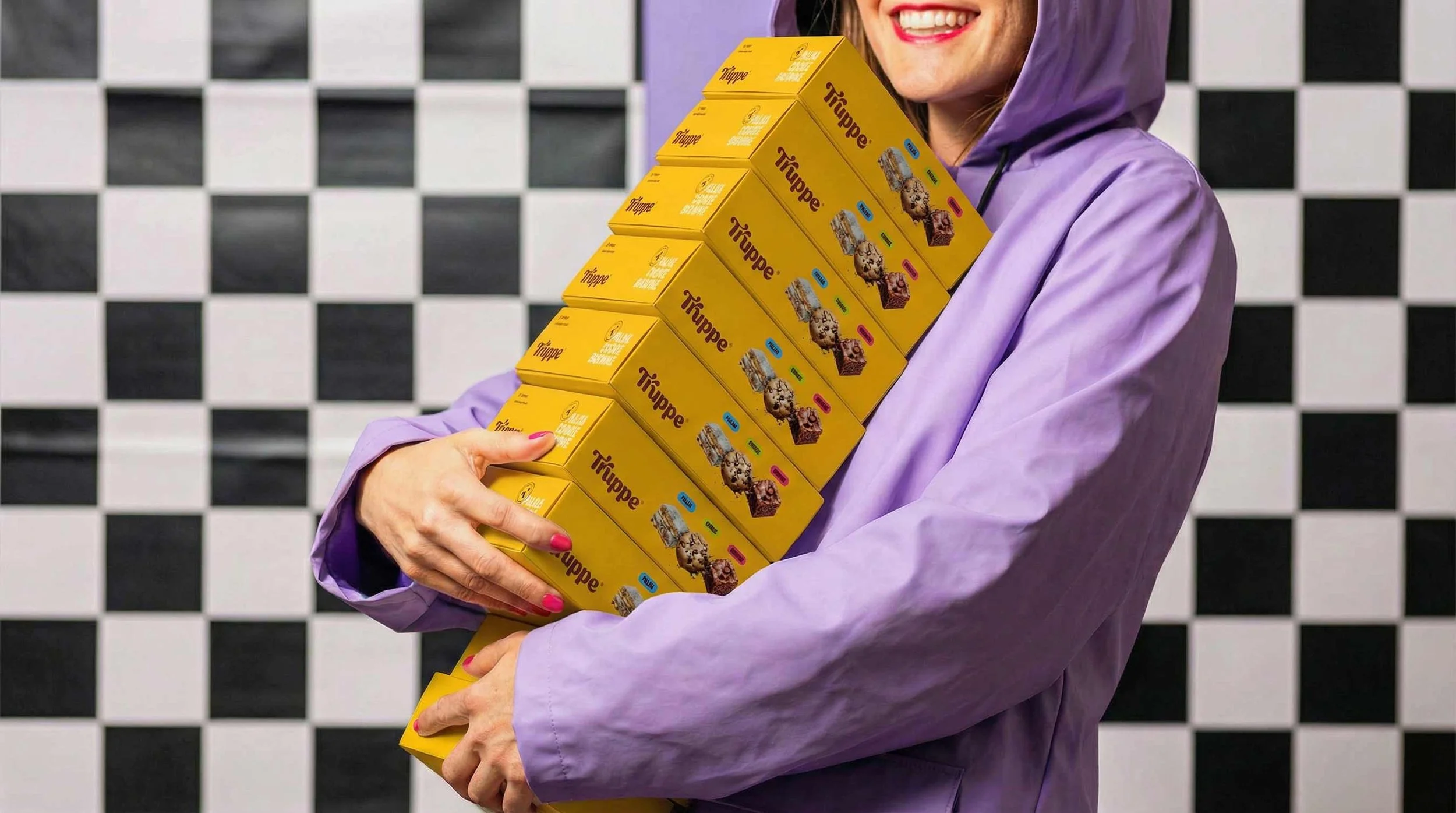
Packaging System Highlights
Brand-first hierarchy: Truppe
Clear product category identification (Cookie, Brownie, Palha)
Easy-to-read flavor names
Well-structured legal and product information
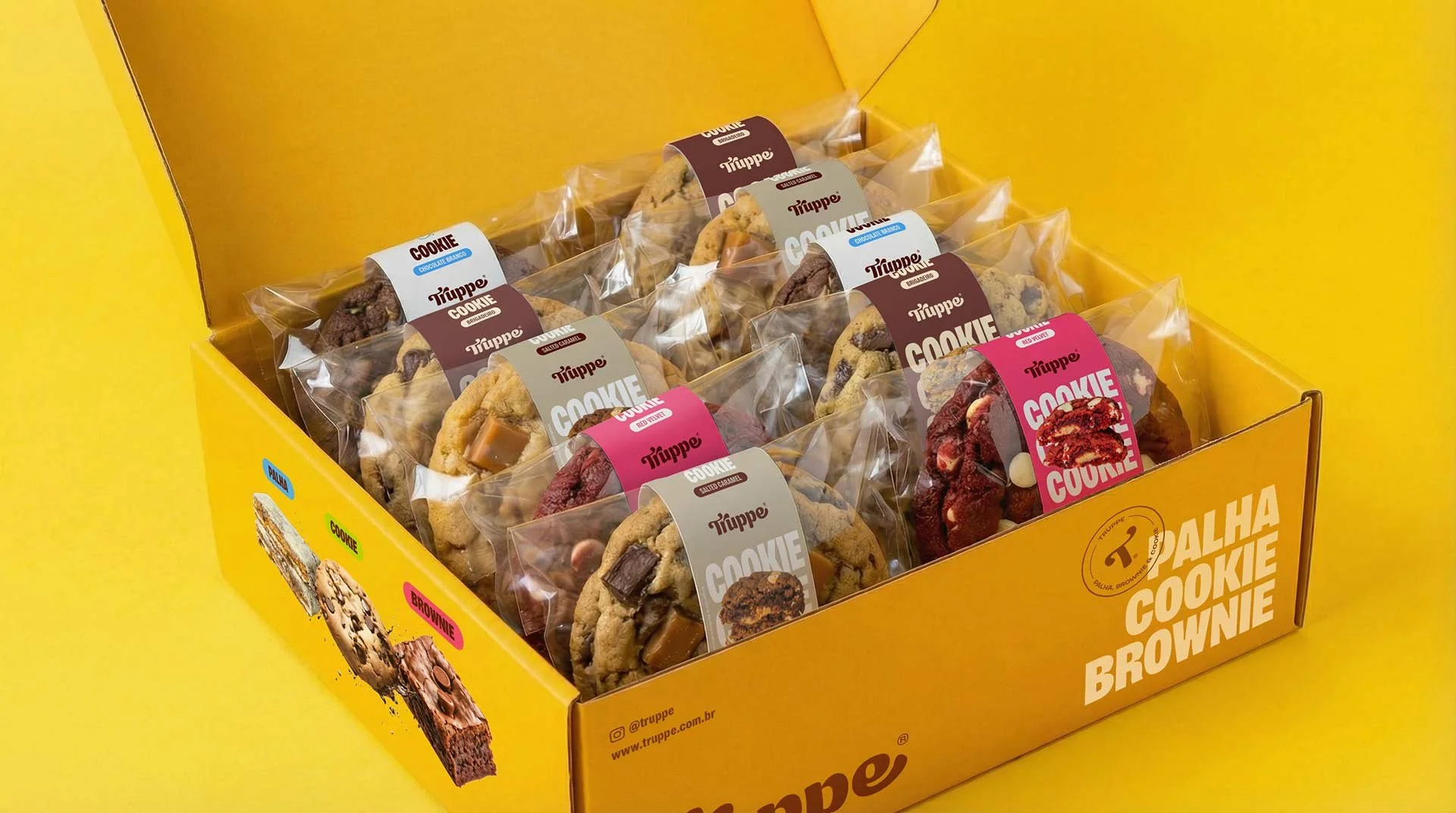
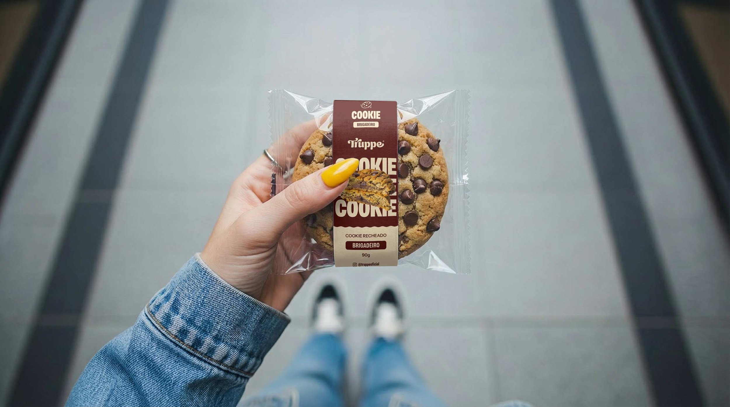
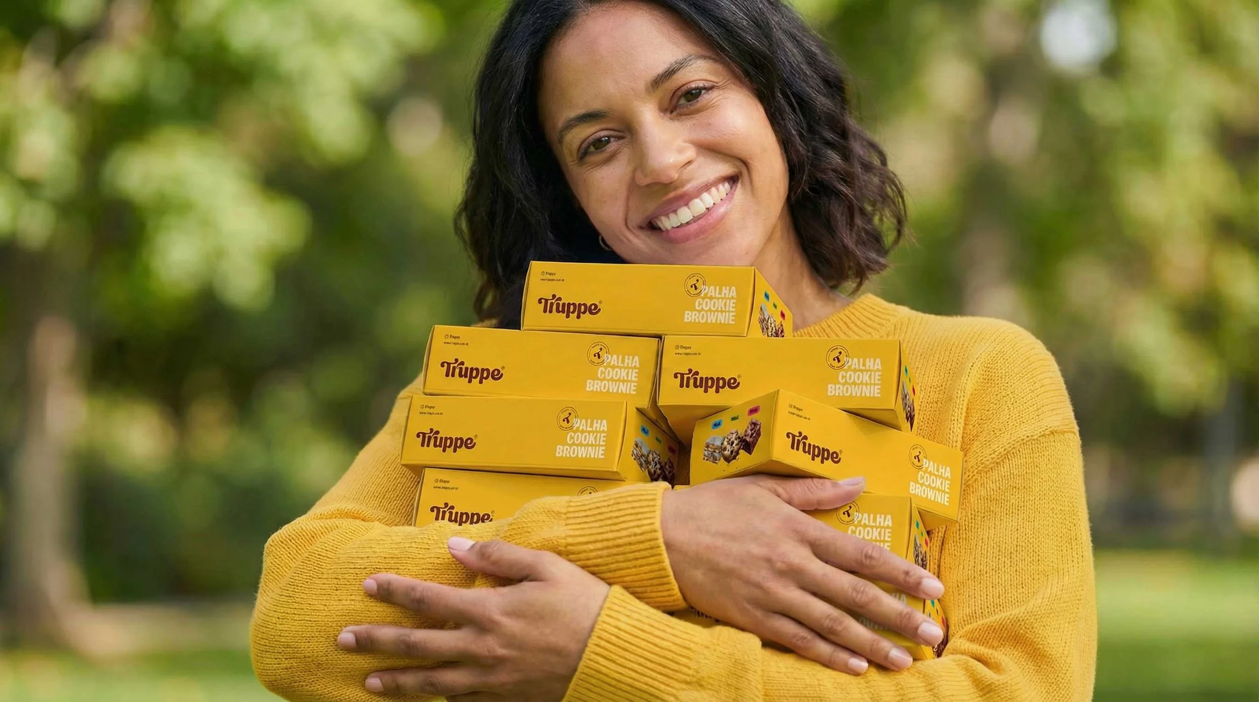
Each cookie package features:
A unique color assigned to each flavor
A consistent layout across the product line
High contrast for maximum shelf visibility
This packaging design system improved in-store navigation, increased perceived value, and reinforced a cohesive cookie branding strategy.
Key Learnings from This Cookie Branding Case Study
Cookie branding must support future growth and expansion
Strong brand systems outperform isolated design decisions
Food packaging design is one of the most powerful branding tools
Clear positioning simplifies product and market expansion
Conclusion: Designing a Scalable Cookie Brand for the Future
This cookie branding case study shows how strategic food branding, visual identity design, and packaging systems can drive growth, differentiation, and long-term value.
More than a visual update, Truppe became a brand designed to scale in the evolving gourmet sweets market.
Ready to start a new project?
Drop us a message to schedule a meeting or request a customized quote. We'd love to hear more about challenges.